721
Hyperagent: An AI Agent Platform Built by Airtable
design
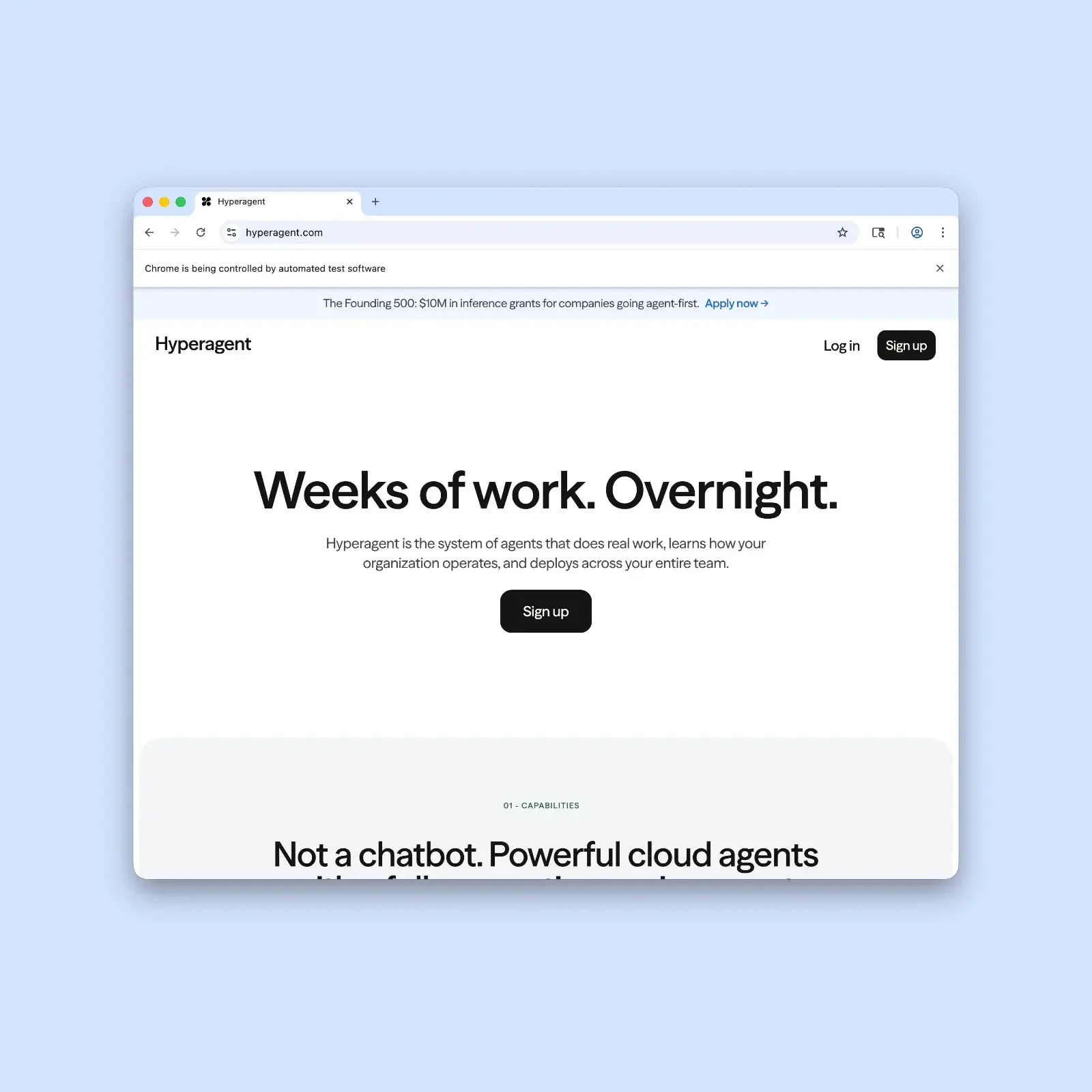
Hyperagent by Airtable is an AI agent platform that runs on stark type, a single input bar, and real work output — no diagrams, the product speaks first.
722
Xinmei Liu: Editorial Illustration With Ink and Argument
illustration
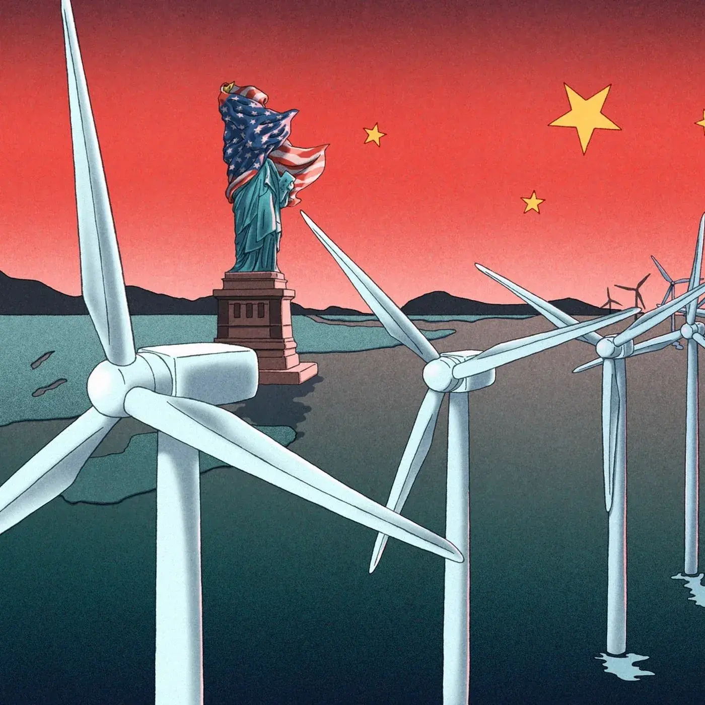
Xinmei Liu's 2025 editorial illustrations for The Economist, Atlantic, and Bloomberg make sharp, geopolitical arguments in pen-and-ink at magazine scale.
723
KOEP Hair Salon Brand Identity by kidz studio
branding
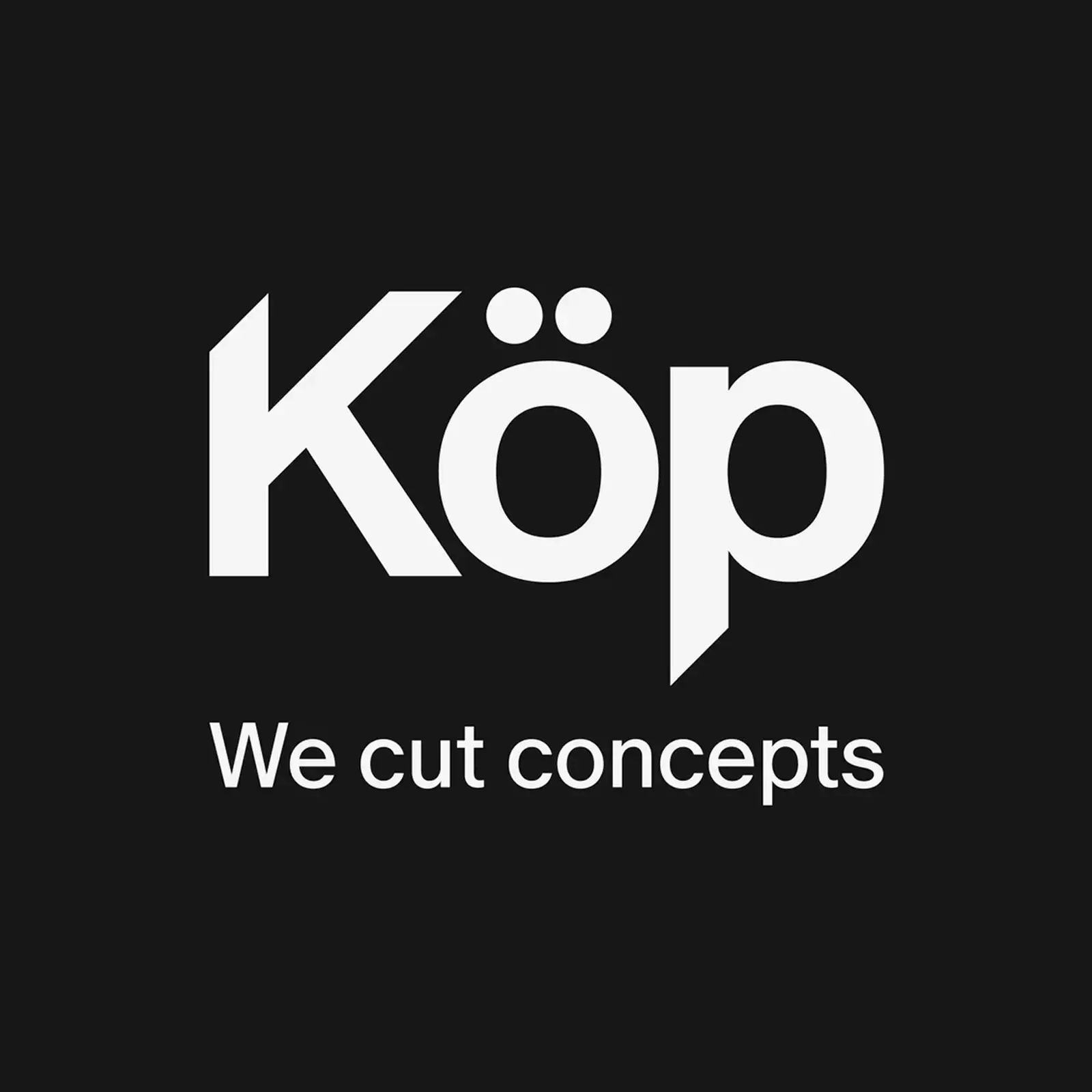
kidz studio built a hair salon brand identity for KOEP on one rule: the 45-degree cut. Every mark, card, and print motif in the system traces back to it.
724
Studio Five Brand Identity Fuses Culture and Craft
branding
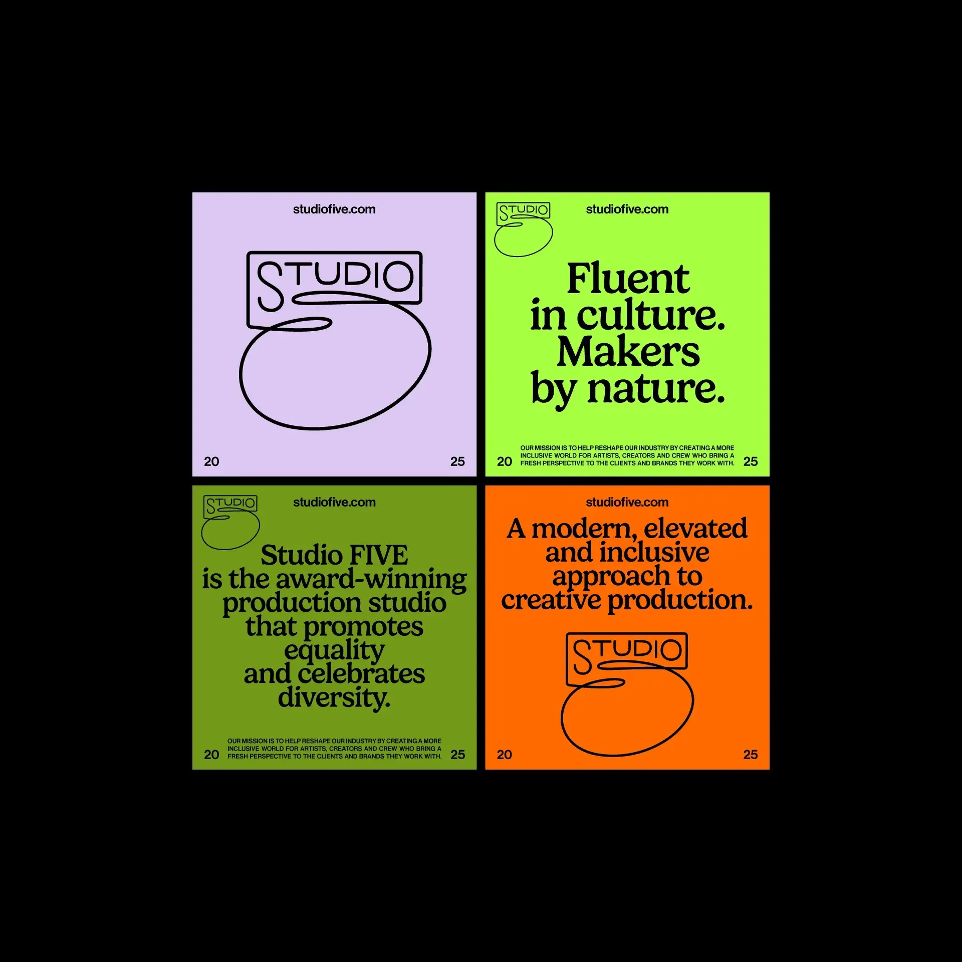
Studio Five brand identity by The Negra pairs electric lime and tangerine with a hand-drawn ‘5’ logomark — built for a creative studio fluent in culture.
725
LUE Collagen Supplement Packaging Design
branding
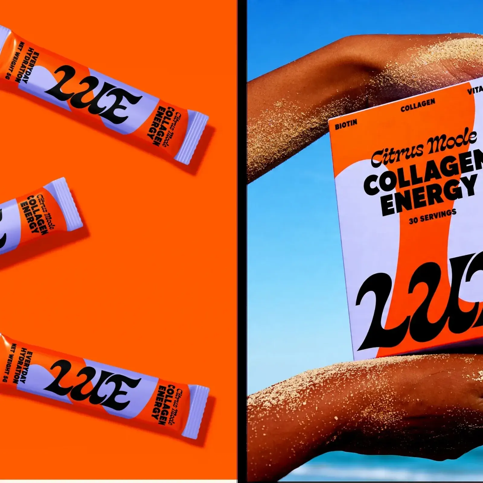
LUE is a modern supplement branding project by Yuliia Hrabynska that captures a bold, Gen Z-focused aesthetic through vibrant color palettes and striking typography.
726
Plant Atelier: A Clean E-Commerce Design for Indoor Plants
design
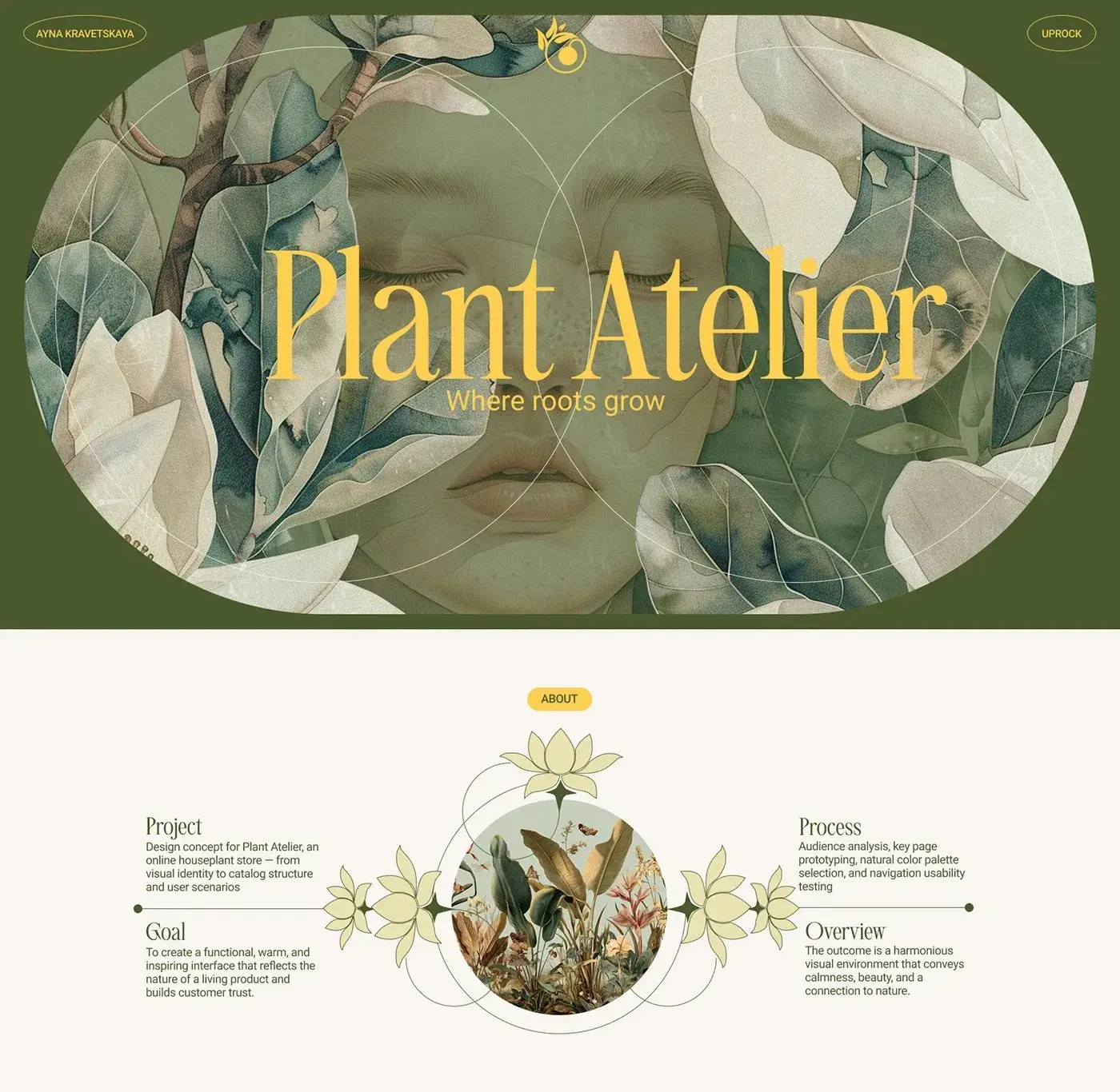
Plant Atelier is an e-commerce design for indoor plants. Clean layouts, natural greens, and a cozy digital storefront by Moscow designer Ayna Kravetskaya
727
Muted Char's Incense Packaging Looks Like a Found Object
branding
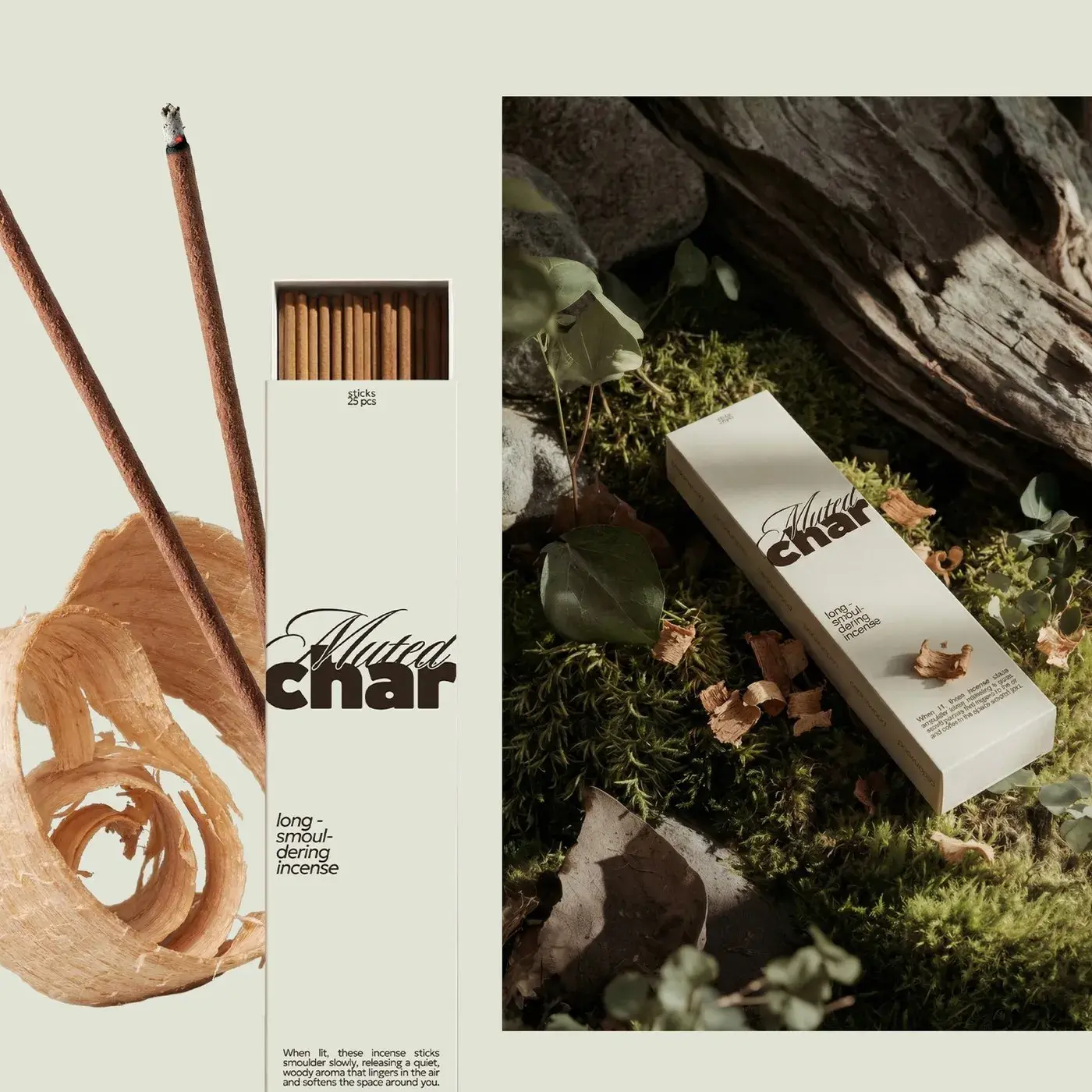
Muted Char is a minimal incense brand packaging design where off-white paper, dark matte tin, and a weight-contrast logotype do every bit of the talking.
728
Soto Branding by Forner Studio
branding
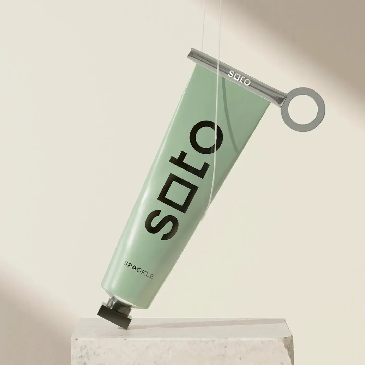
Forner Studio's Soto branding turns home improvement into a creative act — square-to-circle wordmark, sage green packaging, and pure modernist restraint.
729
QUENTO: Didone Display Typeface for Editorial Headlines
Typography
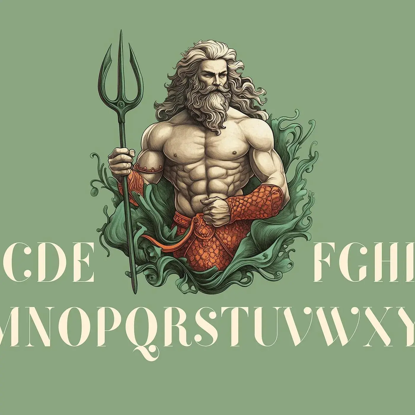
QUENTO is a Didone display typeface by Kimmy Lee and Petros Afshar. Extreme stroke contrast, true vertical axis, and 550+ glyphs for editorial headlines.
730
Bloodhound Cafe Branding by Johanna Szpetun
branding
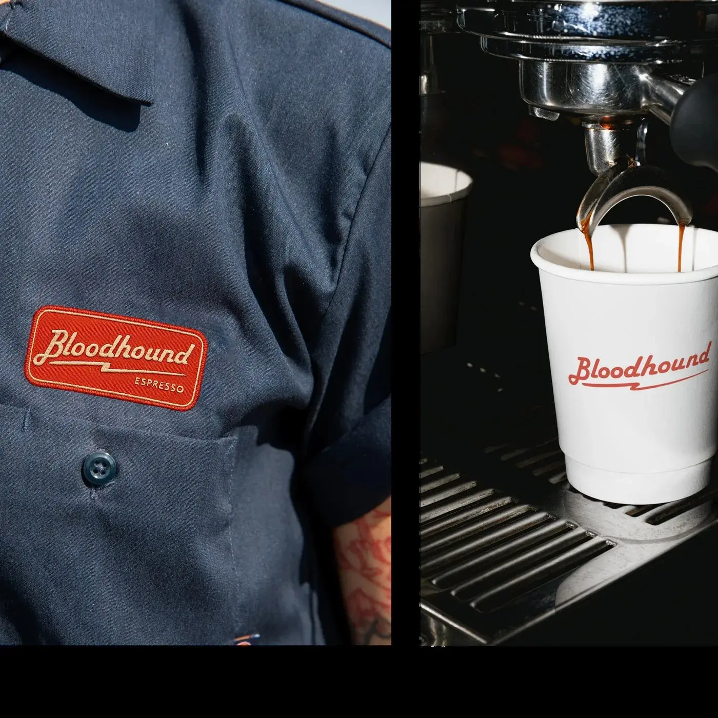
Bloodhound is a cafe branding project by Johanna Szpetun for a Darlinghurst venue built around the concept of human fuel.
731
Architecture Brand Identity Design: Anvila Wordmark as Floor Plan
branding
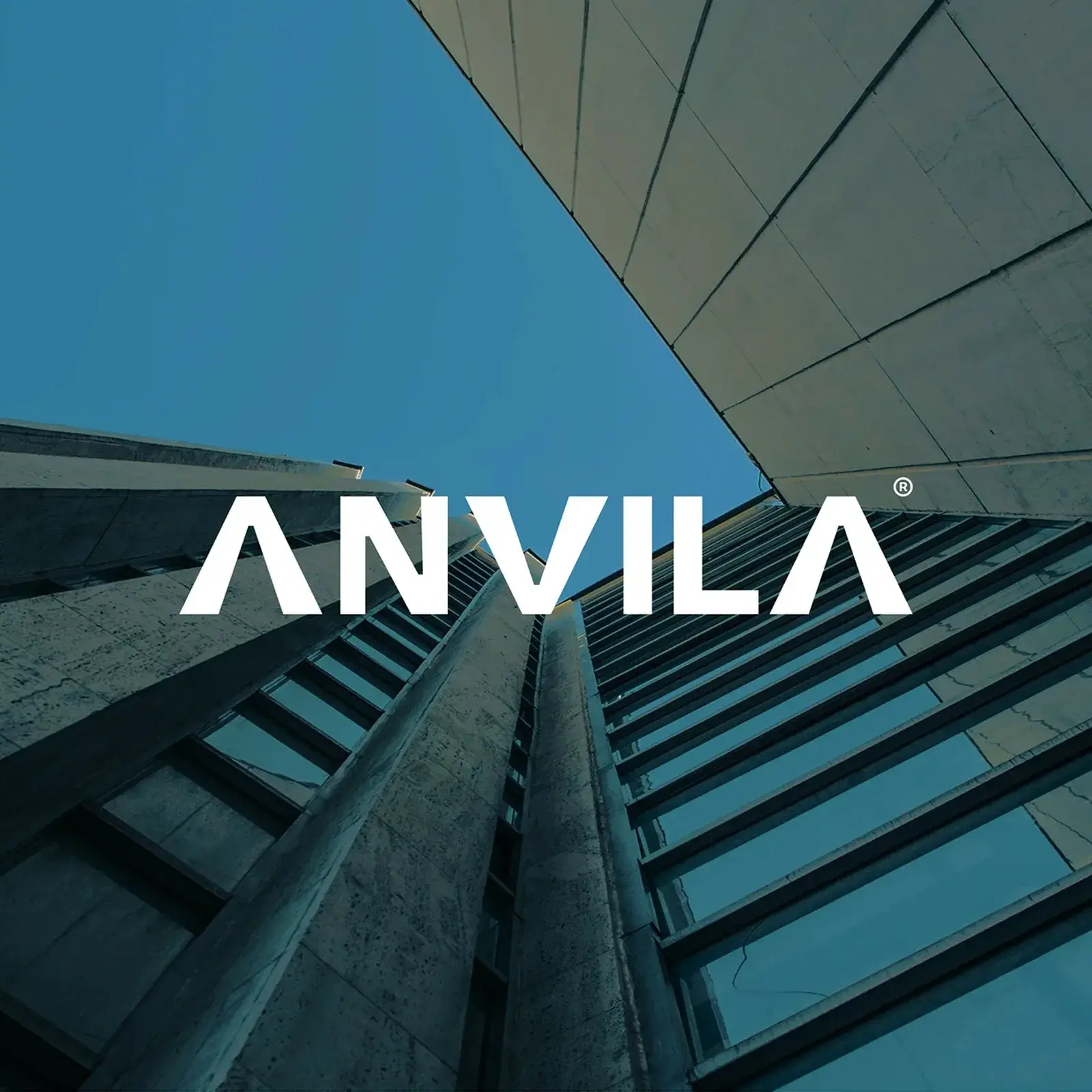
Anvila is an architecture brand identity design. Wordmark A and V letterforms are drawn from sectional geometry — built like a floor plan, not styled up.
732
Best of the Week: Motion, Mass, and Material
best of the week
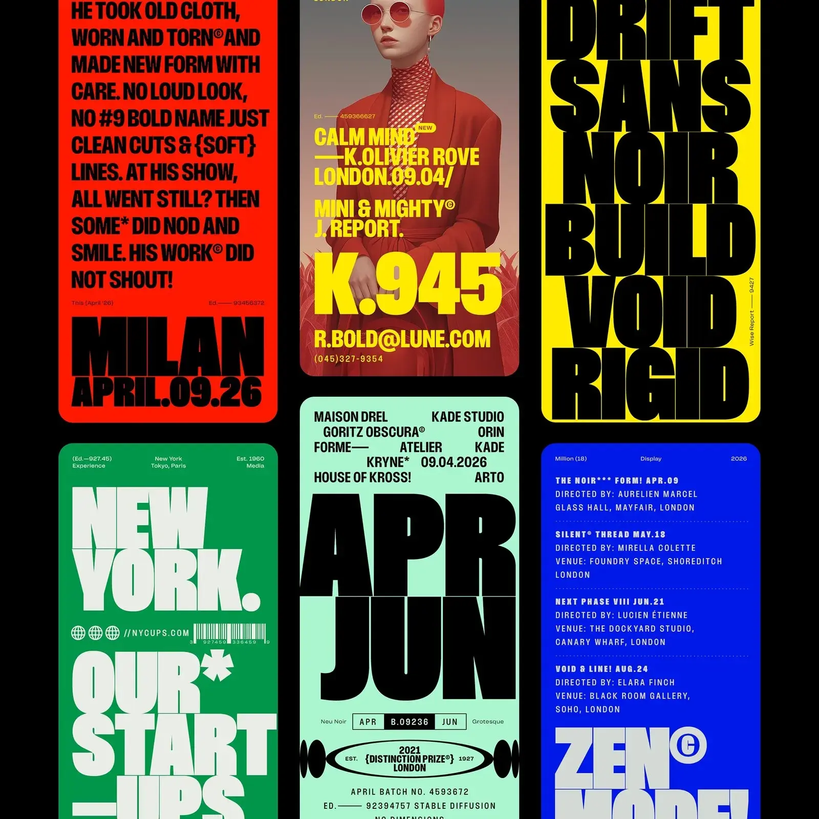
This week's strongest work shared a structural quality: every piece has something physically legible about it. A typeface built for dominance at frame-filling scale.
733
CRAVEA Coffee Brand Identity and Packaging Design
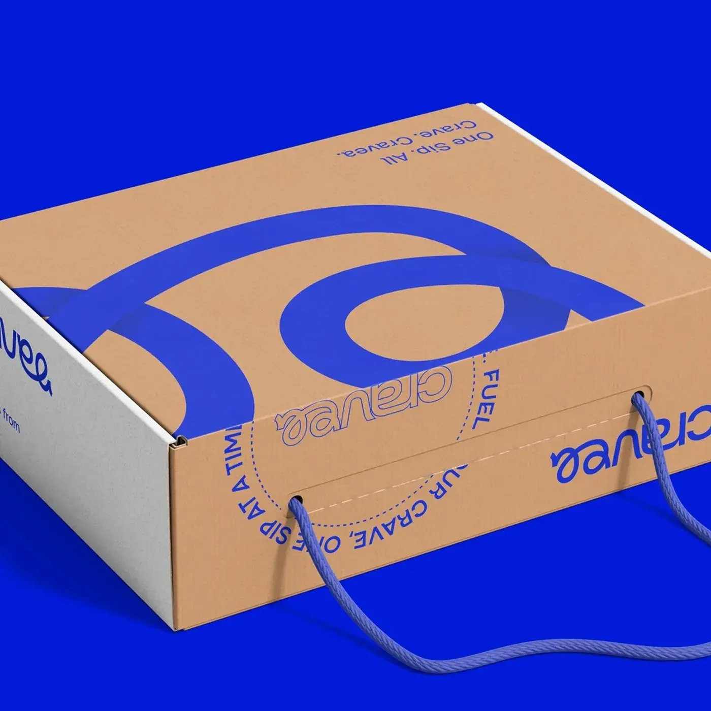
Sleeko Studio and DewApples Studio built CRAVEA's coffee brand identity and packaging design as one total system — cobalt blue, custom wordmark, line art
734
Ruff Lamp: 3D Printed Lamp by Mina Wright
design
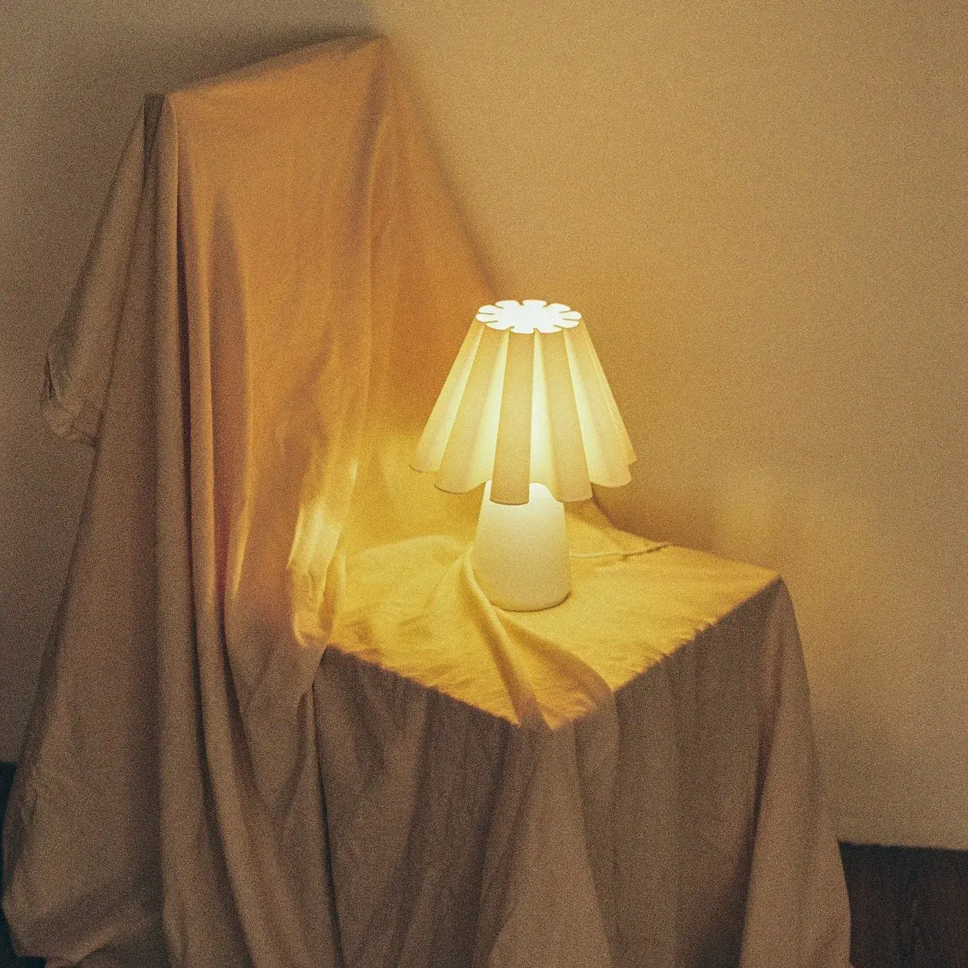
The Ruff Lamp is a 3D printed lamp by Mina Wright — ten stacked recycled PLA rings translating a 16th-century ruff collar into precise, layered geometry.
735
Plus X Rebuilt KT's Corporate Identity for Telecom Scale
branding
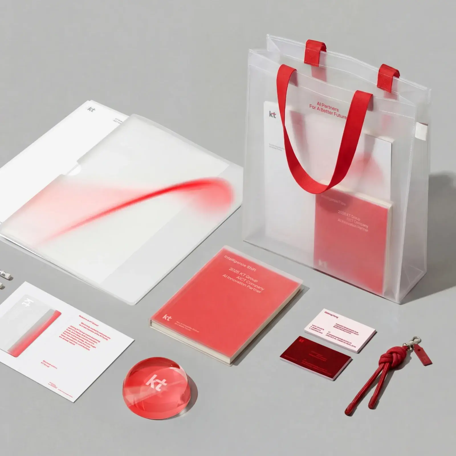
Plus X rebuilt KT’s corporate identity around a curvilinear Flow motif, a bespoke typeface, and a coral gradient that scales from app icon to lobby wall.
736
ATF Manarola Font by Arkitype Foundry
Typography
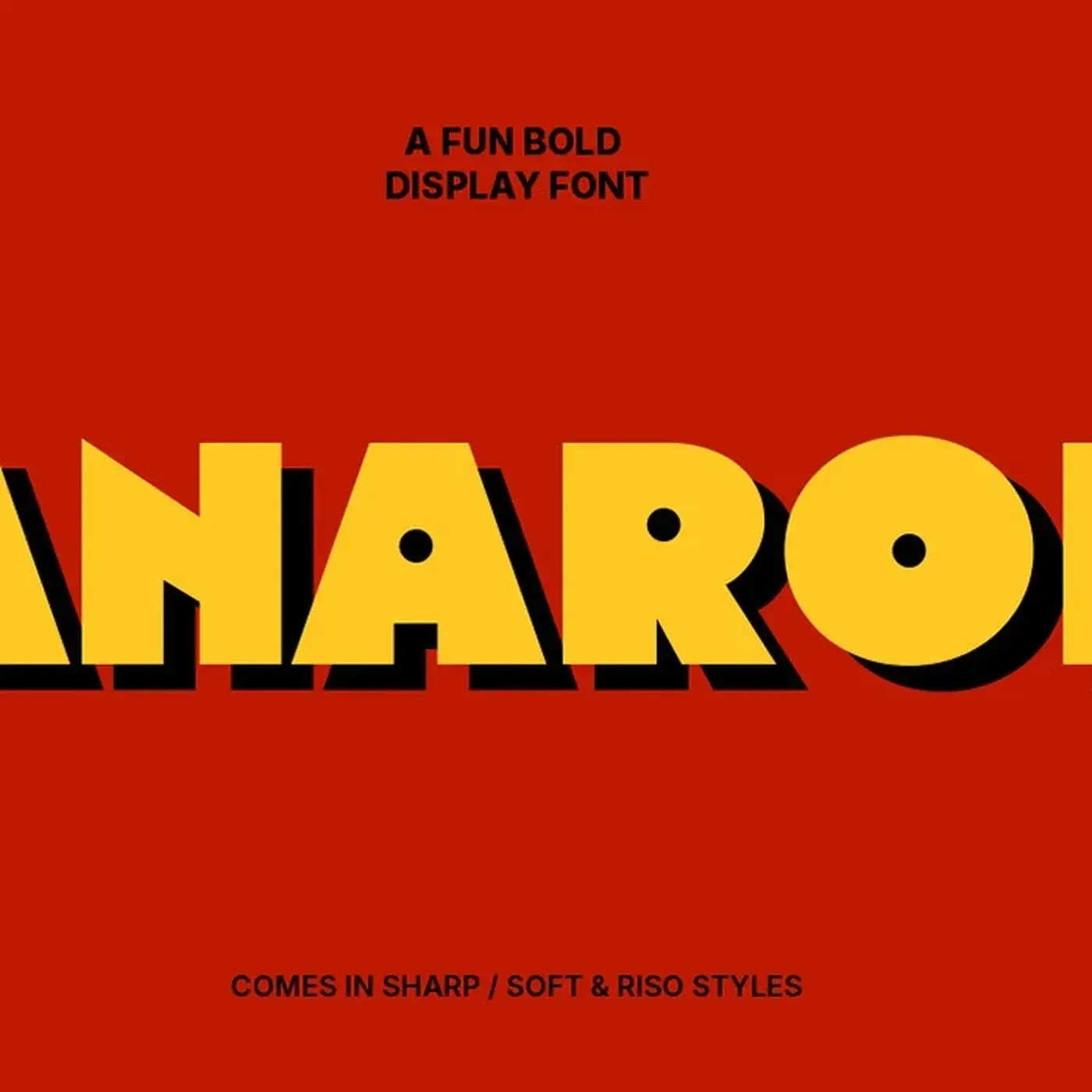
ATF Manarola font is a bold display typeface by Arkitype Foundry, built in vintage Italian signage tradition with three styles and Mediterranean palette.
737
How Clay Built the Eden Branding for an AI Home Design App
branding
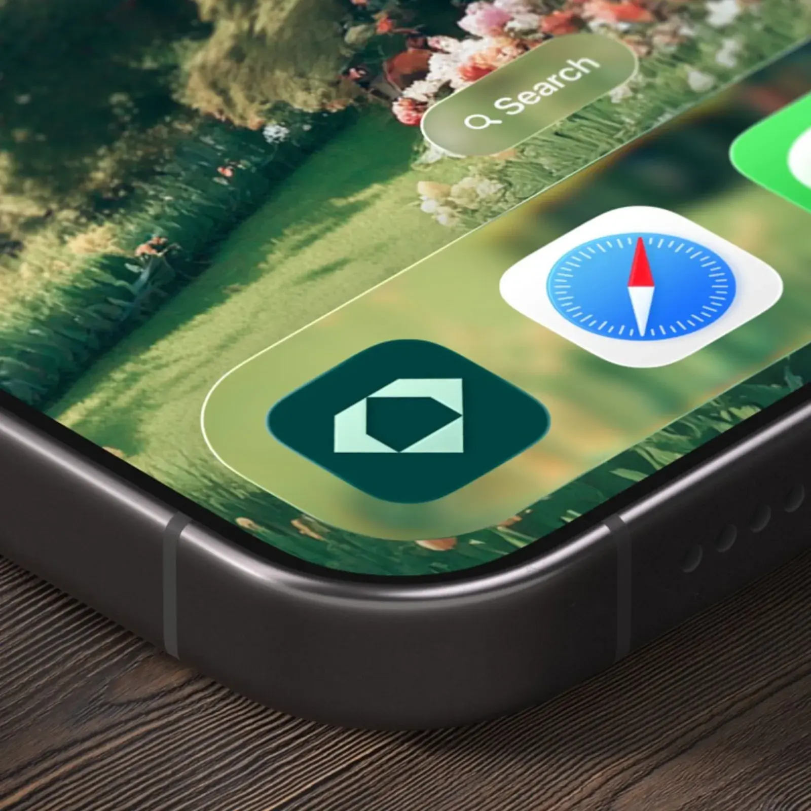
Clay shaped Eden branding for an AI home design app — Martina Plantijn serif headlines, ABC Diatype body, terracotta palette, botanical photography.
738
Mamico Kids Store Branding by TRUE AGENCY
branding
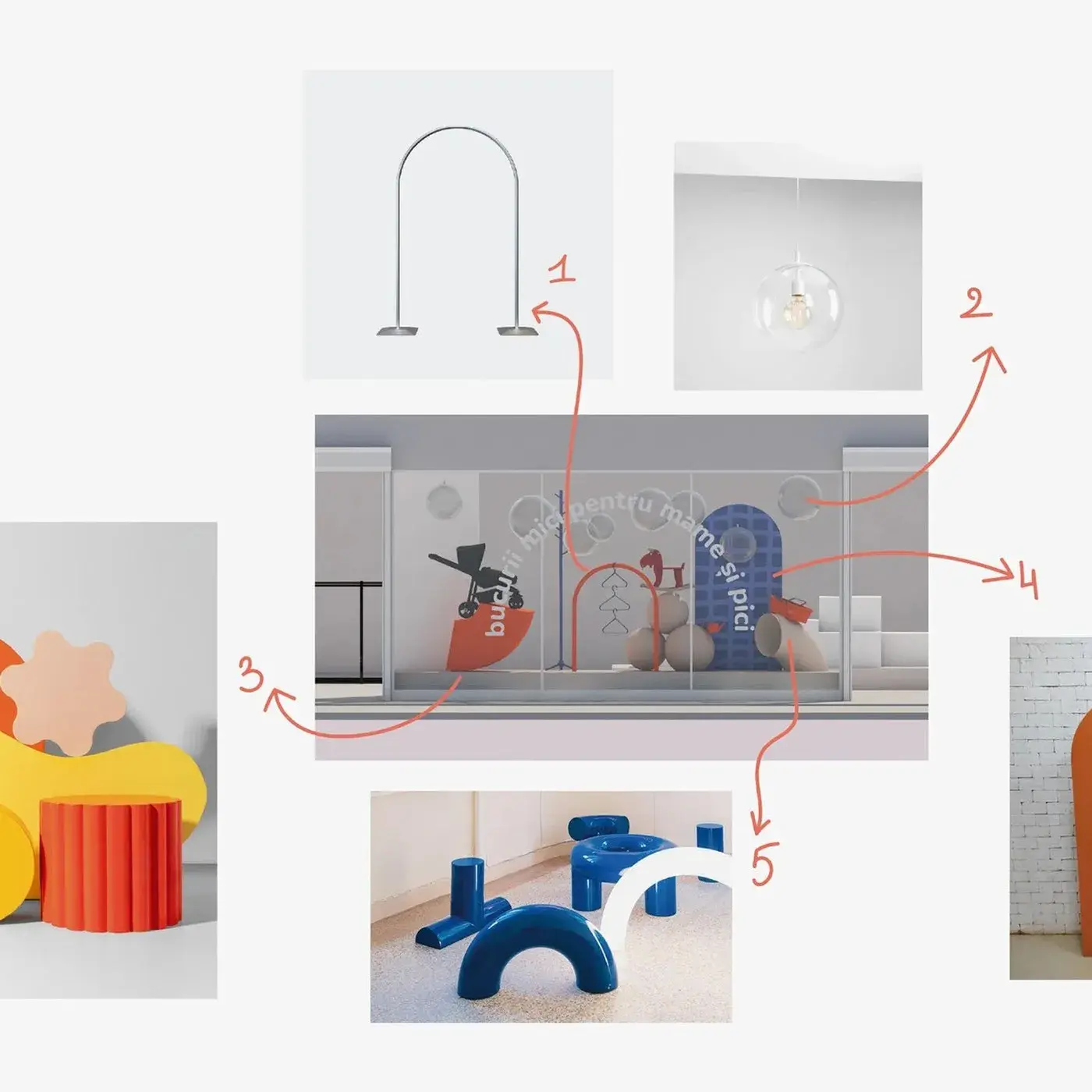
TRUE AGENCY's Mamico kids store branding covers 1,700 m² — isometric zoning maps, coral-orange play structures, and a double-heart M mark at every scale.
739
Lumenist: Exploring Digital Light and 3D Color Rendering
3d-art

Lumenist explores 3D color rendering where light bleeds across simple forms. Alex Maltsev focuses on chromatic transitions and rendering without geometry.
740
Will Bank Identity: A Geometric System in Yellow
branding
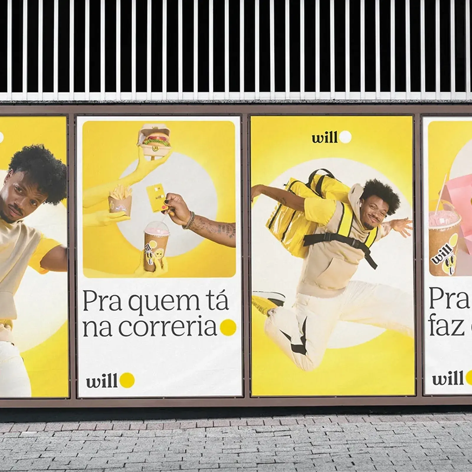
Will bank identity by Renan Benvenuti combines acid yellow with a geometric wordmark system applied across signage, stationery, and campaign photography.