201
San Francisco to Yellowstone: A Photography Journey
photography
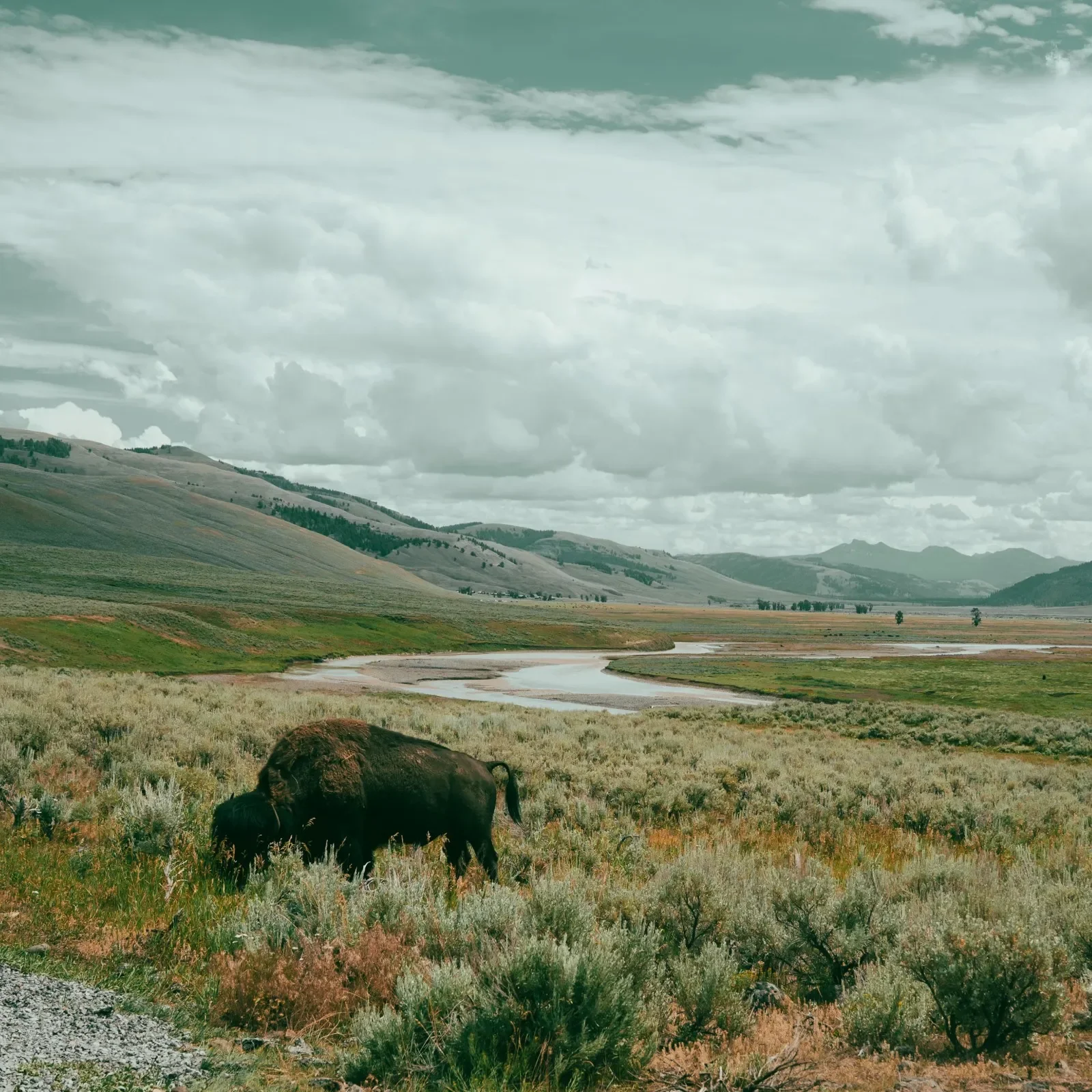
A travel photography journal documenting a camper van road trip from San Francisco to Yellowstone, captured on Sony, Ricoh, and Lumix cameras.
202
Typography: Fluxetype Variable Typeface by Nikita Kanarev
Typography
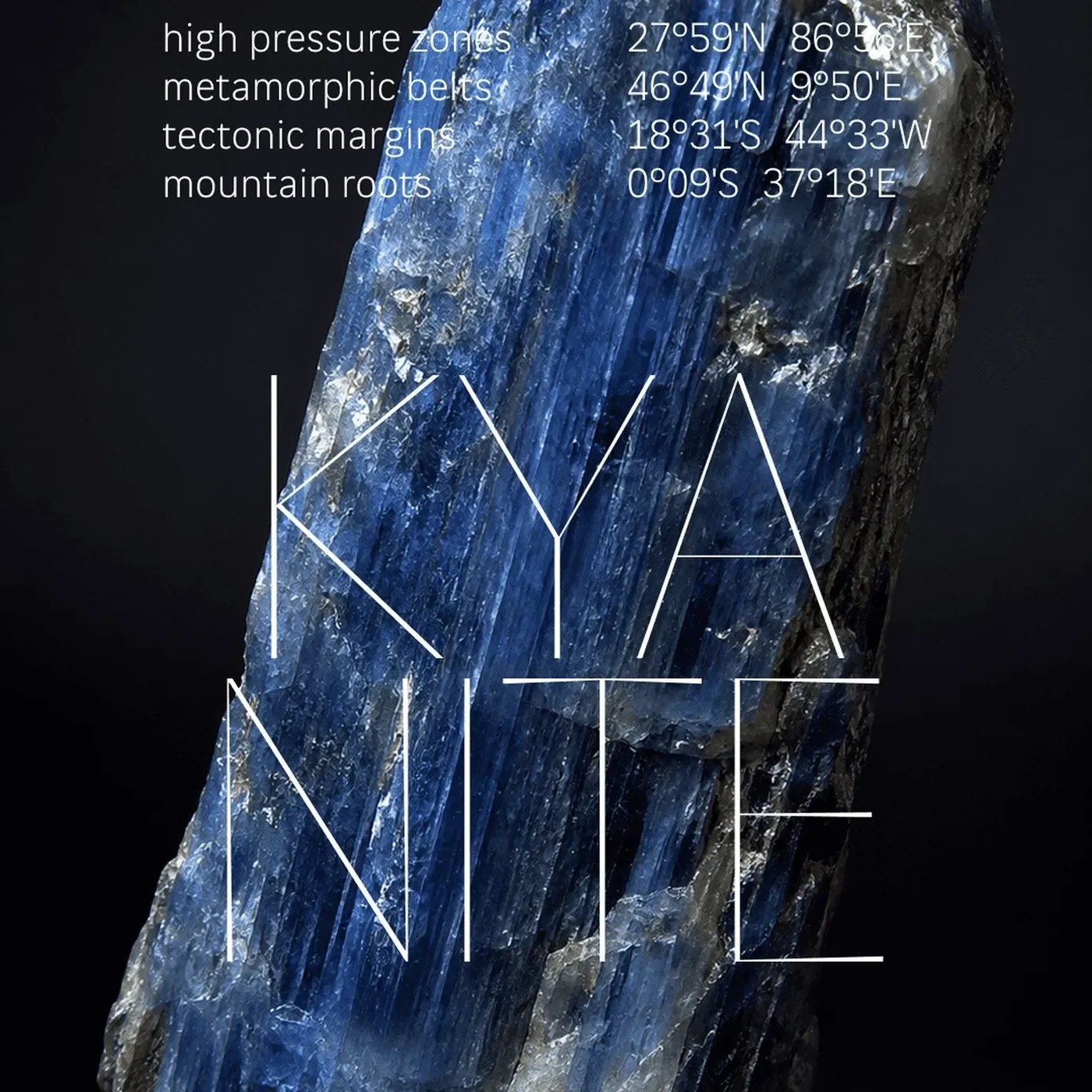
Discover Fluxetype, a versatile typography system by Nikita Kanarev bridging humanist sans and serifless roman across three variable axes.
203
Packaging Design: Saucy by Nathalia Ultramar
packaging

Discover the bold packaging design for Saucy by Nathalia Ultramar, pairing punchy typography with bespoke color palettes and body care bottles.
204
Best of the Week: Editorial Pacing and Modular Type
best of the week
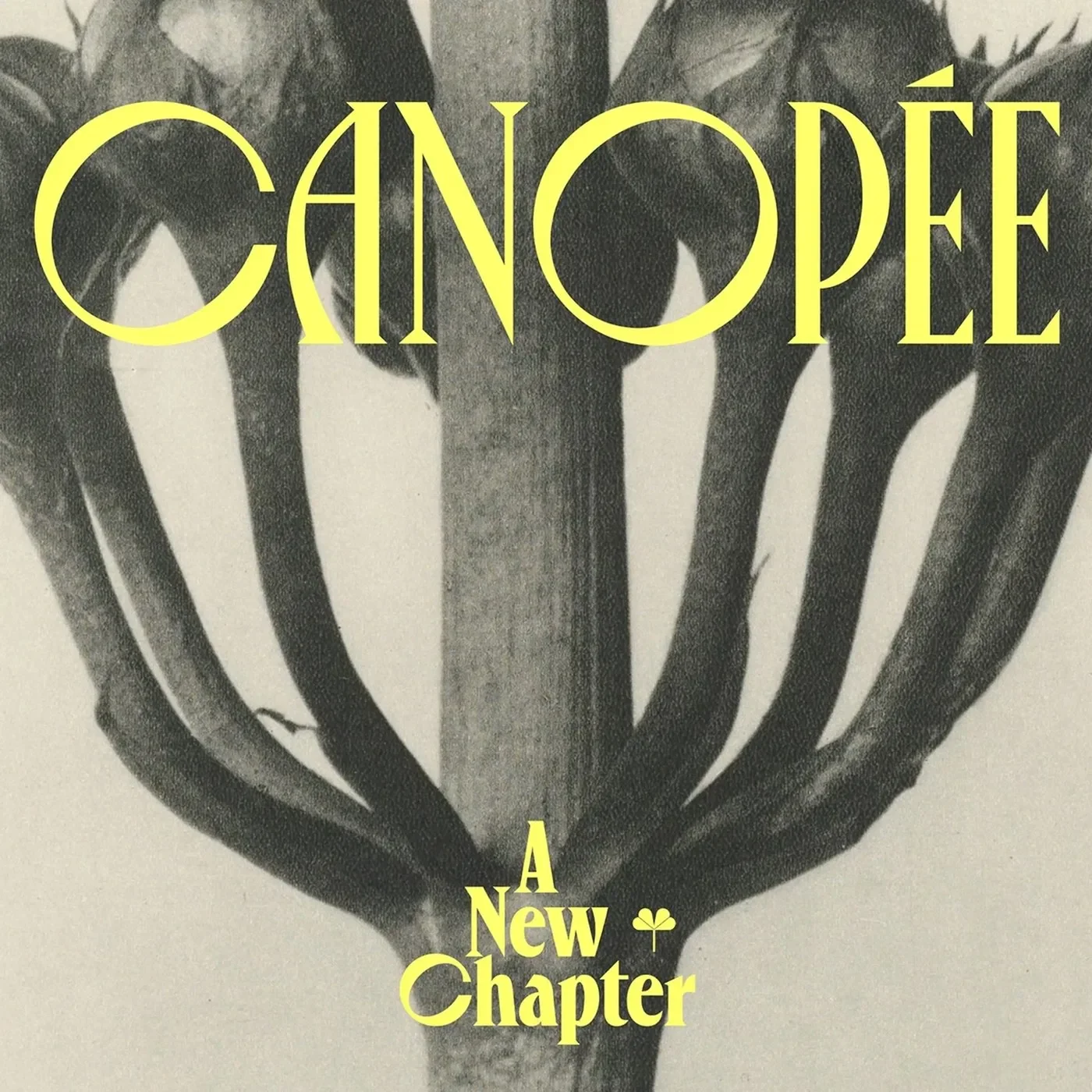
We gather the best of the week features across branding, packaging, editorial design, and typography from ISO week 2026-W37, spotlighting architectural grids and tactile print craft.
205
Editorial Design: Trace Magazine by SocioDesign
editorial
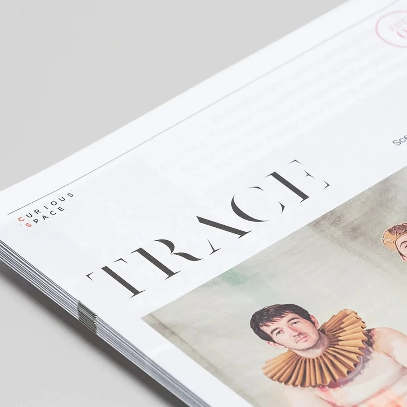
SocioDesign crafted Trace Magazine with clean editorial design. The biannual print piece frames spatial work with calm skill.
206
Editorial Design: Kolt Magazine by Alice Poma & Studio Feixen
editorial
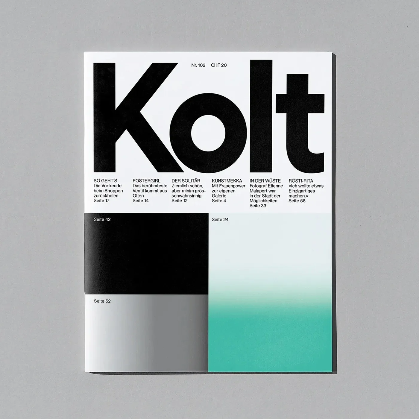
Alice Poma and Studio Feixen crafted a dynamic editorial design for Swiss cultural publication Kolt Magazine, featuring bold typography.
207
Brand Identity: Chaos by Youssef Abdelhamid
branding
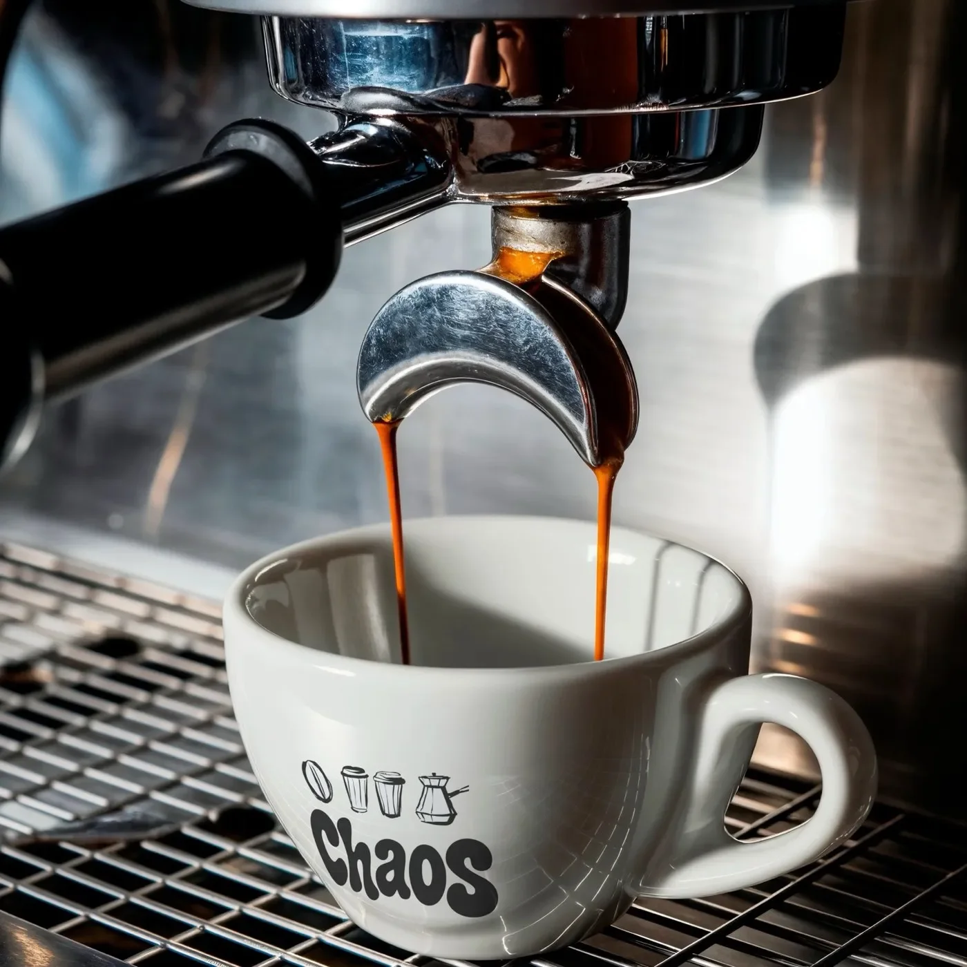
Youssef Abdelhamid designs a tactile brand identity for Chaos coffee, pairing chubby Moresugar typography with linocut iconography.
208
Spatial Design: Province of Antwerp Wayfinding by Silo
architecture
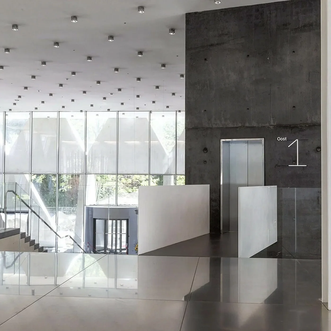
Silo designed a disciplined spatial design and wayfinding system for the Province of Antwerp headquarters, framing XDGA's brutalist tower.
209
Brand Identity: ZEKOSHIP by Rokeya Akter
branding
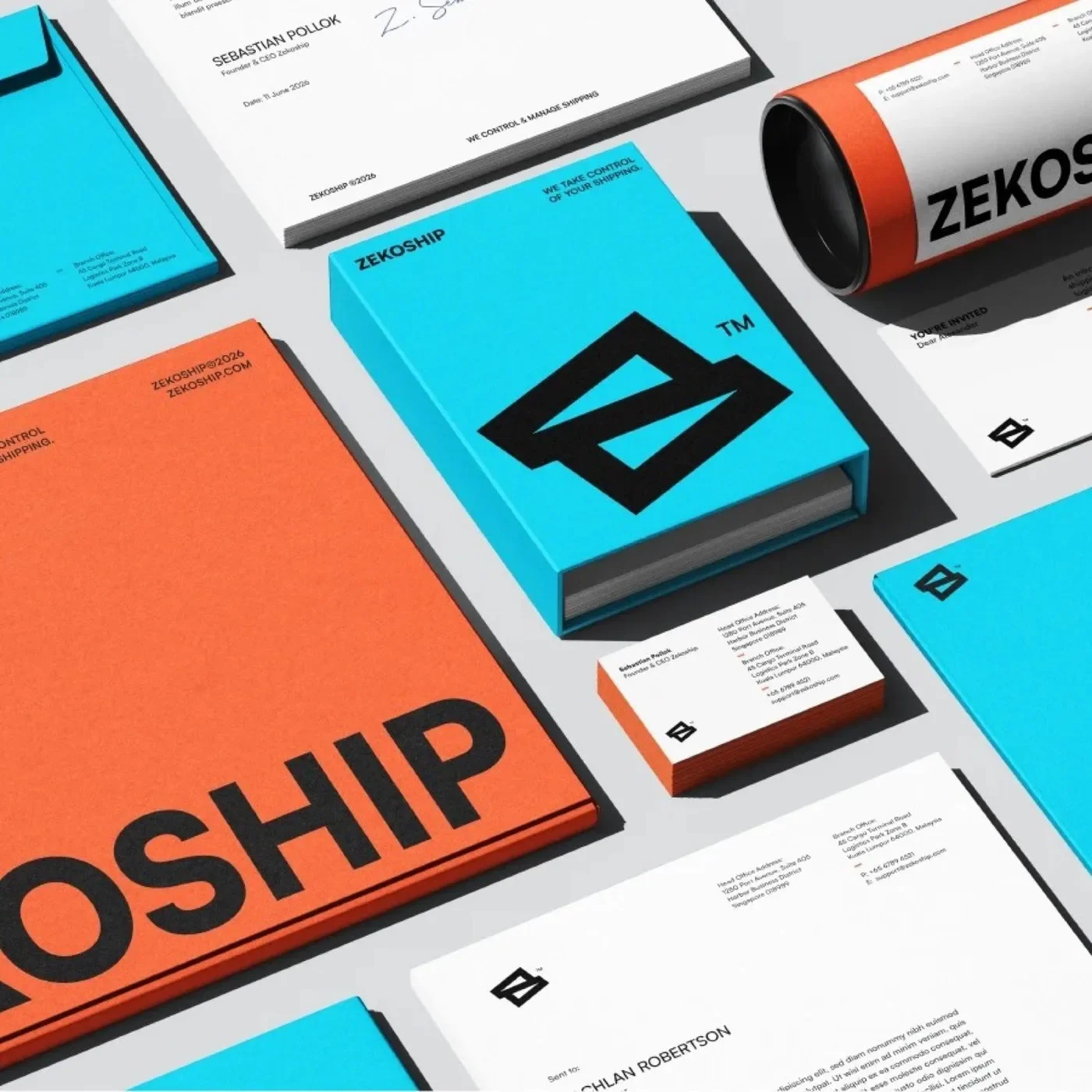
Rokeya Akter crafts a high-impact brand identity for ZEKOSHIP, pairing utilitarian logistics telemetry with high-contrast chromatic restraint.
210
Typography Design: PP Frama by Pangram Pangram
Typography
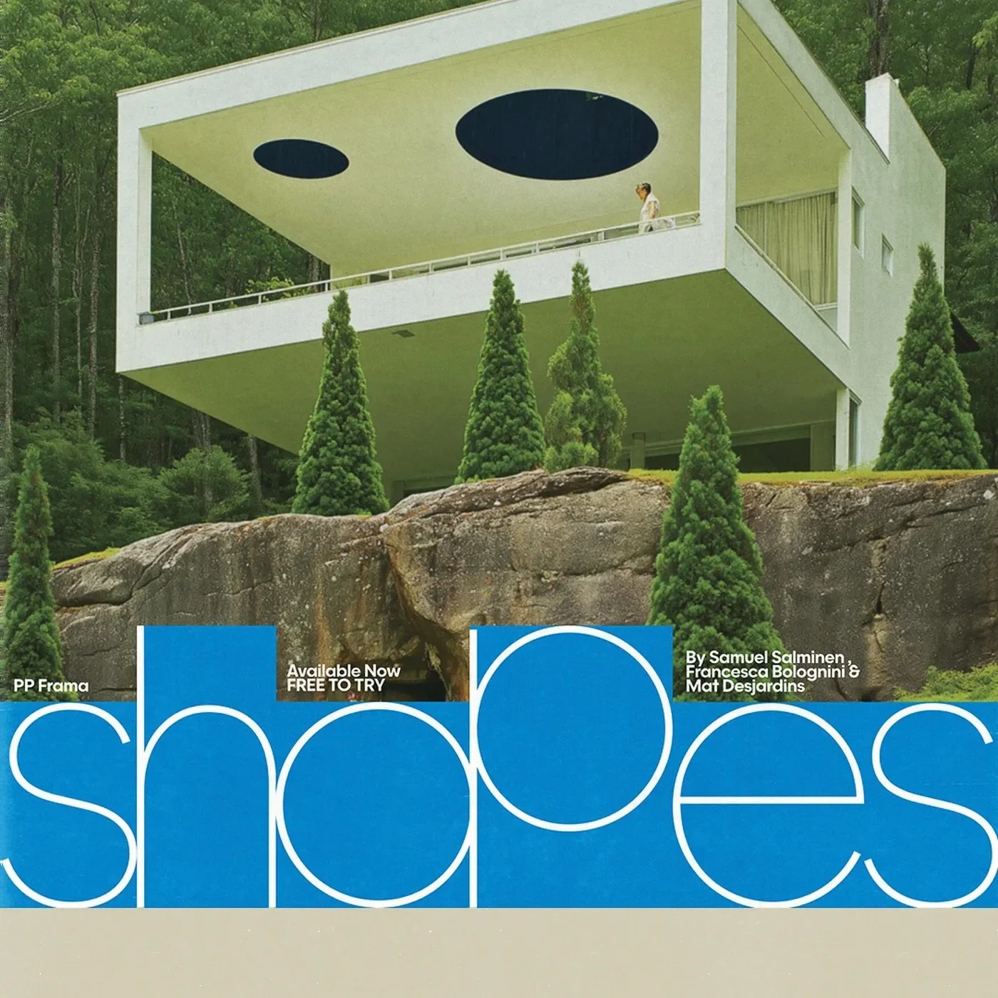
Pangram Pangram crafts a bold typography design with PP Frama. The typeface blends clean Futura geometry with calm modernist rhythm.
211
Branding Design: Le Metronum Visual System by Brand Brothers
branding
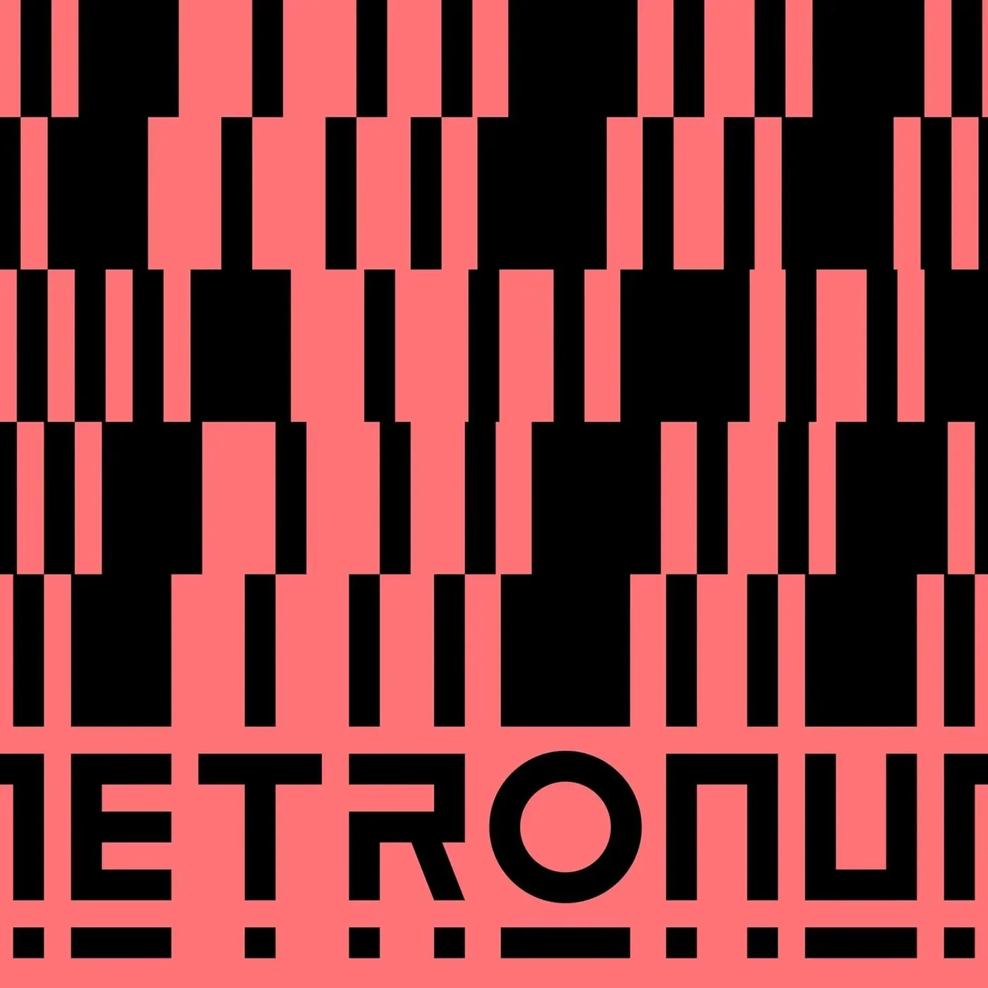
Brand Brothers built a bold branding design for Le Metronum, a Toulouse music venue, using modular geometric patterns and custom type.
212
Web Design: Glyphic Biotechnologies Website by Obys Agency
web

Obys Agency engineers a dark, cinematic web design for Glyphic Biotechnologies, pairing protein sequencing narratives with 3D molecular motion.
213
Brand Identity: The OneGate by Unikorns Agency
branding
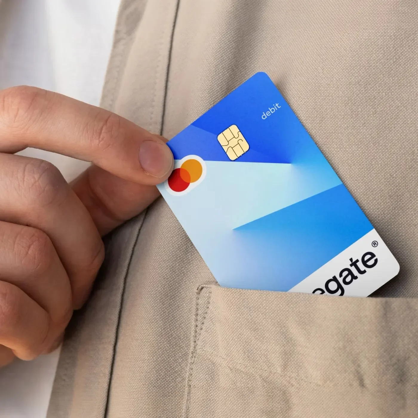
Unikorns Agency creates a luminous brand identity for The OneGate, using angular light gradients, Atyp Display type, and sleek fintech cards.
214
Editorial Design: Lines Breaking by Underline Studio
editorial
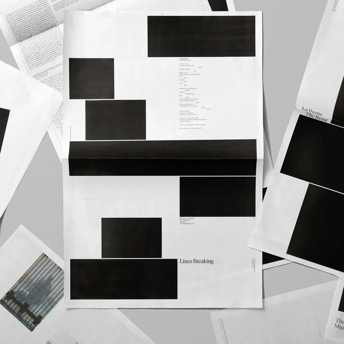
Underline Studio built an urgent editorial design for Lines Breaking. The broadsheet newspaper presents stories on raw newsprint.
215
Brand Identity: Restaurant Elm by József G Kiss
branding
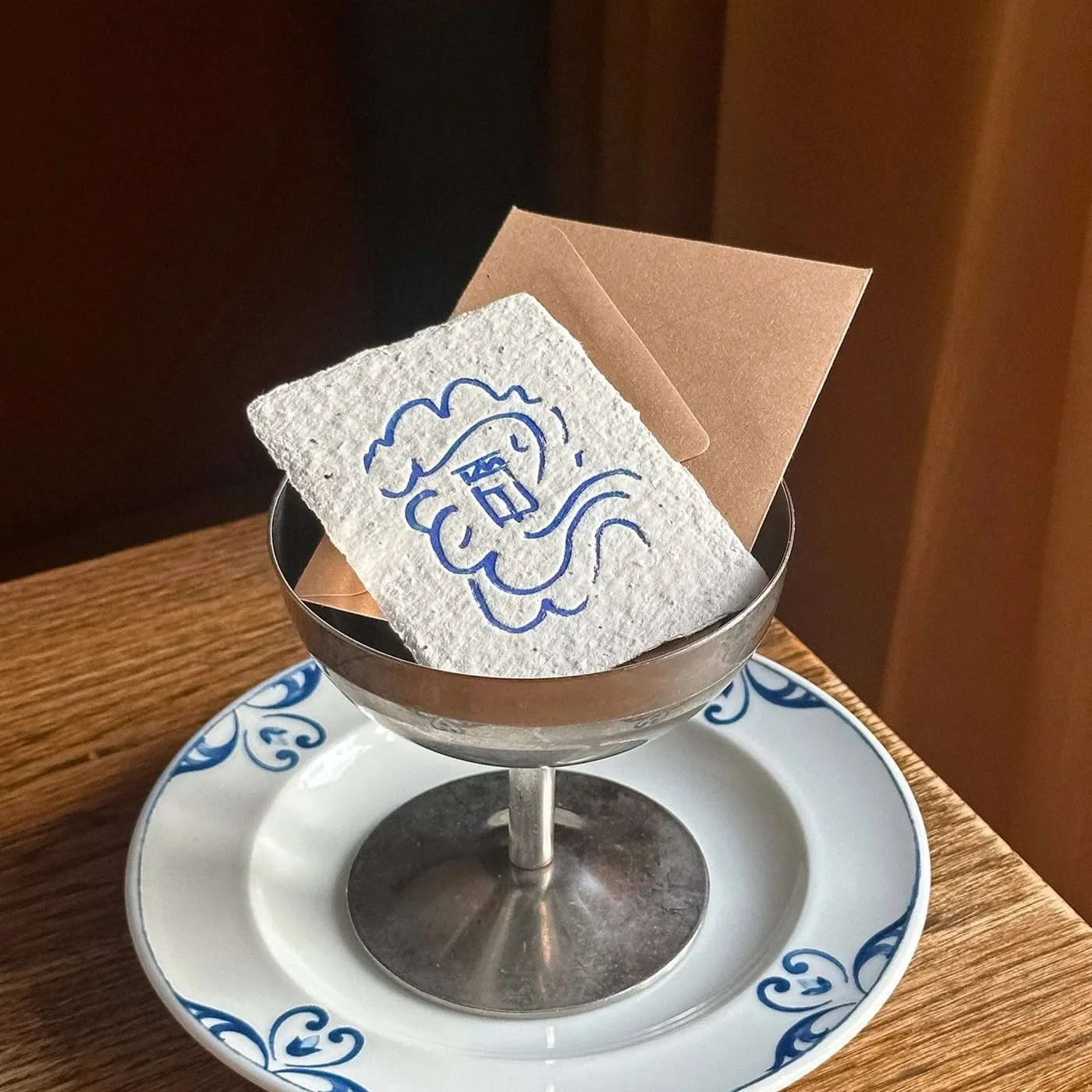
József G Kiss crafts a painterly brand identity for Restaurant Elm in Helsinki, merging Linda Linko art with cyanotypes and Nordic type.
216
Brand Identity: TNB by John John Dias
branding
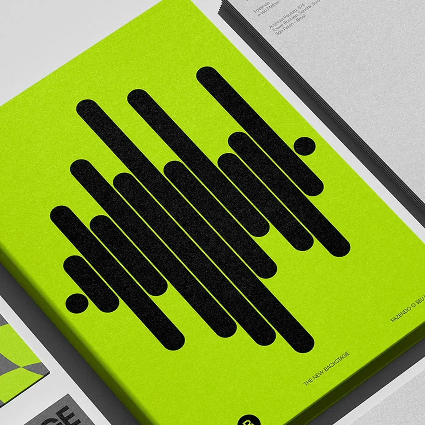
John John Dias crafts a high-octane brand identity for event production firm TNB, pairing acid lime with backstage spotlight telemetry.
217
Packaging Design: TeaGether by Backbone Branding
packaging
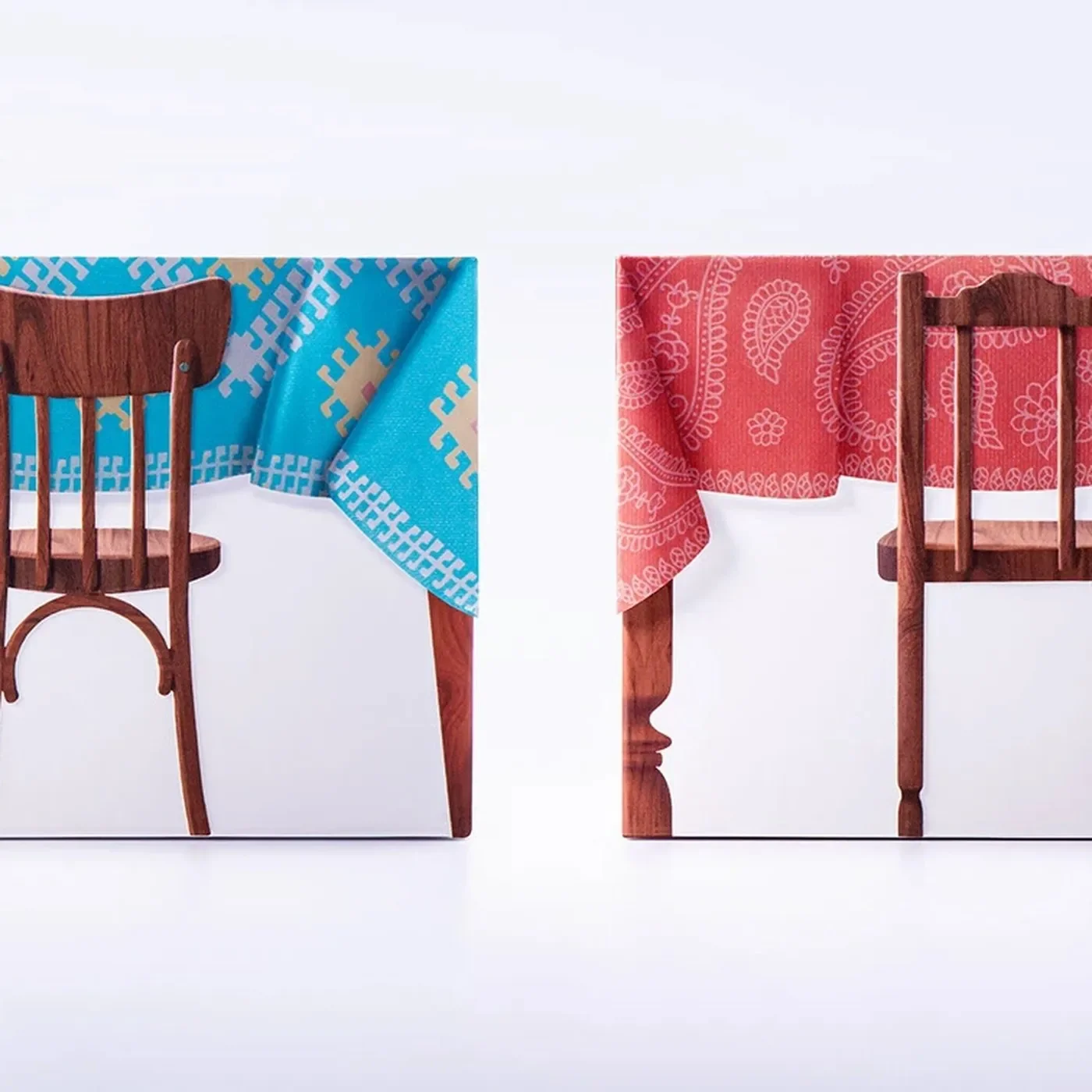
Backbone Branding built a playful packaging design for TeaGether. Quaint wooden tables and tablecloth lids celebrate global teatime sweets.
218
Typography Design: Lock Superfamily by Mash Creative
Typography
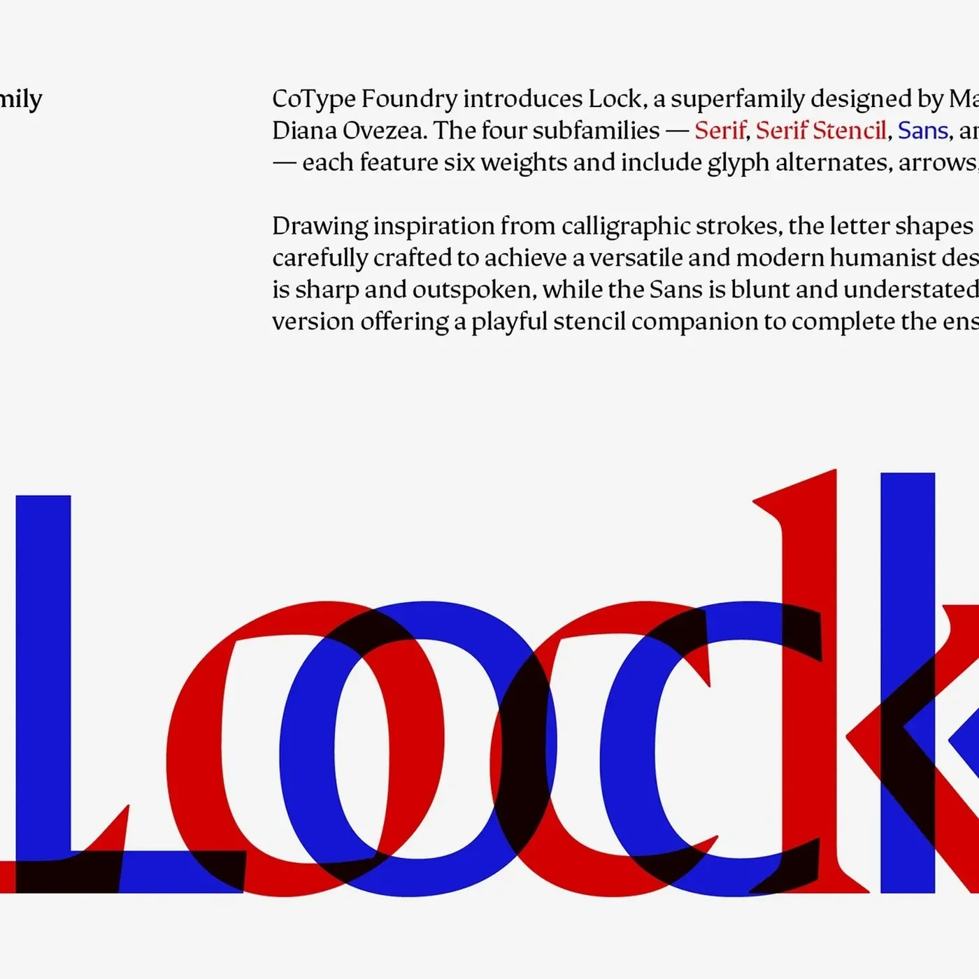
Mash Creative crafts a versatile typography design with Lock Superfamily, uniting sharp serifs, blunt sans letterforms, and playful stencils.
219
Branding Design: No Early Birds by Kurppa Hosk
branding
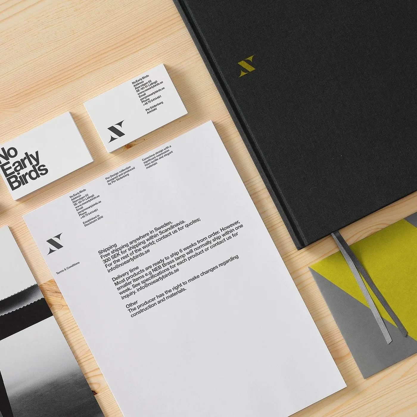
Kurppa Hosk created a sharp branding design for No Early Birds. Modern Swedish furniture meets stark black and white print.
220
Brand Identity: Uncommon by Victor Berriel
branding
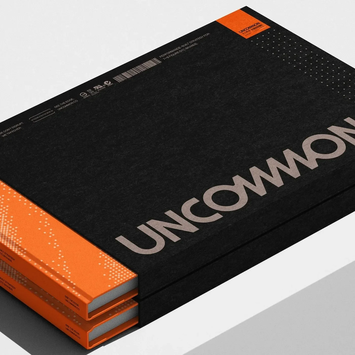
Victor Berriel crafts a high-precision brand identity for DTC agency Uncommon, pairing Neue Montreal with tactical orange telemetry.