Koto's Franki branding turns restaurant discovery into a shared joke, with a yellow, rounded system built around the line Make Time Dance.
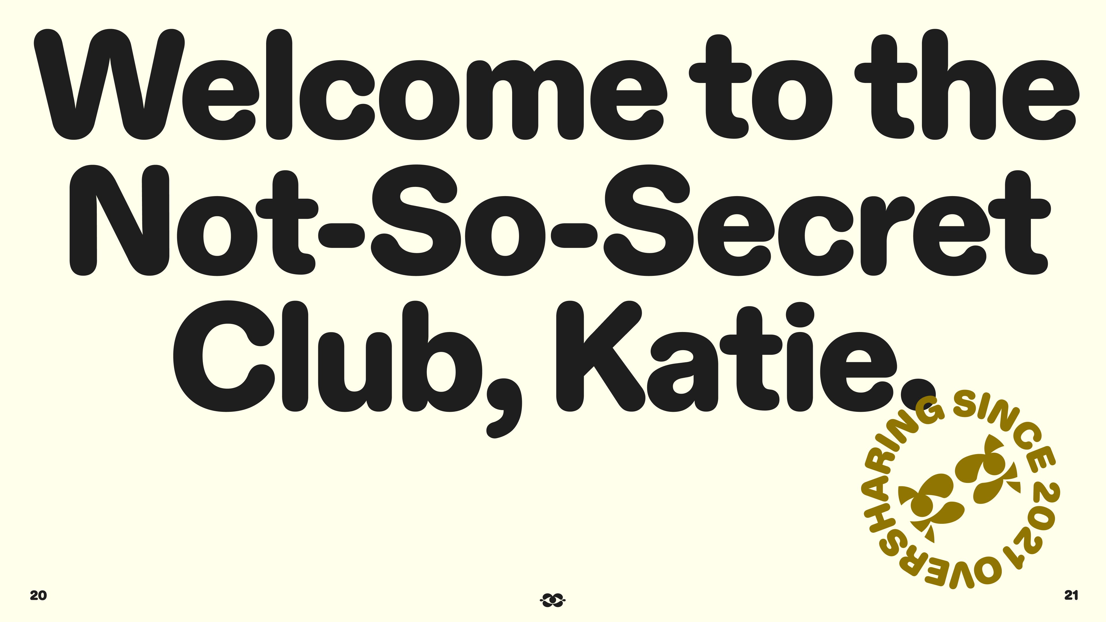
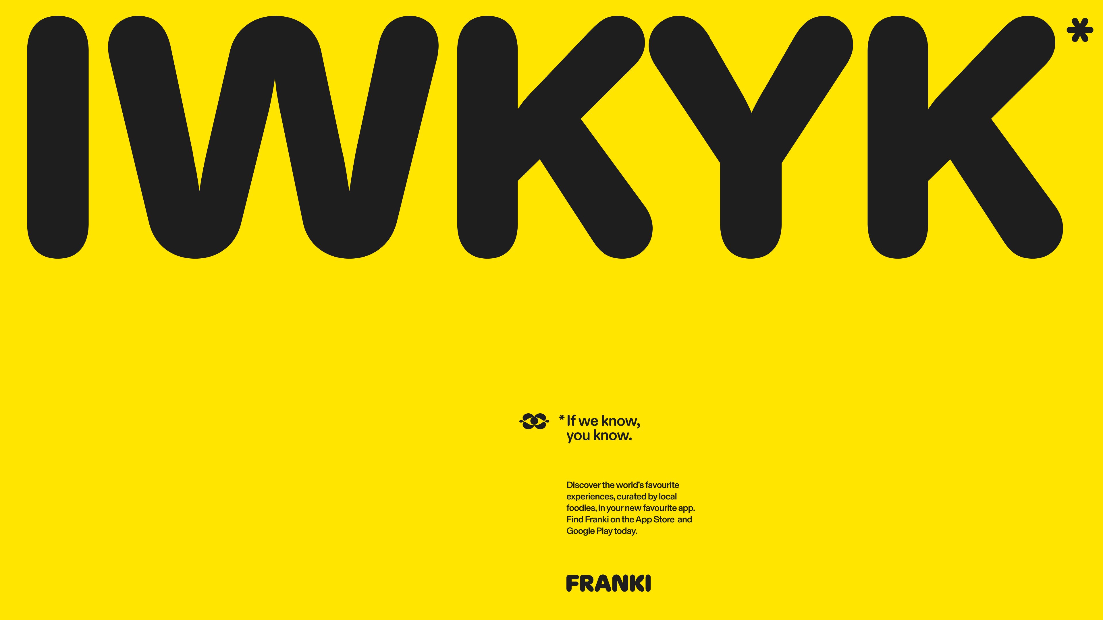
The first thing you notice is the yellow. It is not a highlight or an accent, it is the whole field, and the charcoal type sits on it at a size where the rounded terminals read as soft, almost inflatable shapes. Koto calls Franki an insider's guide, a shortcut to knowing where to go and when, and the work behaves that way: a character symbol that stands for being in the know, candid photos of people mid-meal, and lines that sound like a friend texting you the plan. One poster reads, Welcome to the Not-So-Secret Club, Katie, and another answers with IWYK, short for If we know, you know.
Franki branding, built to move at the pace of a night out
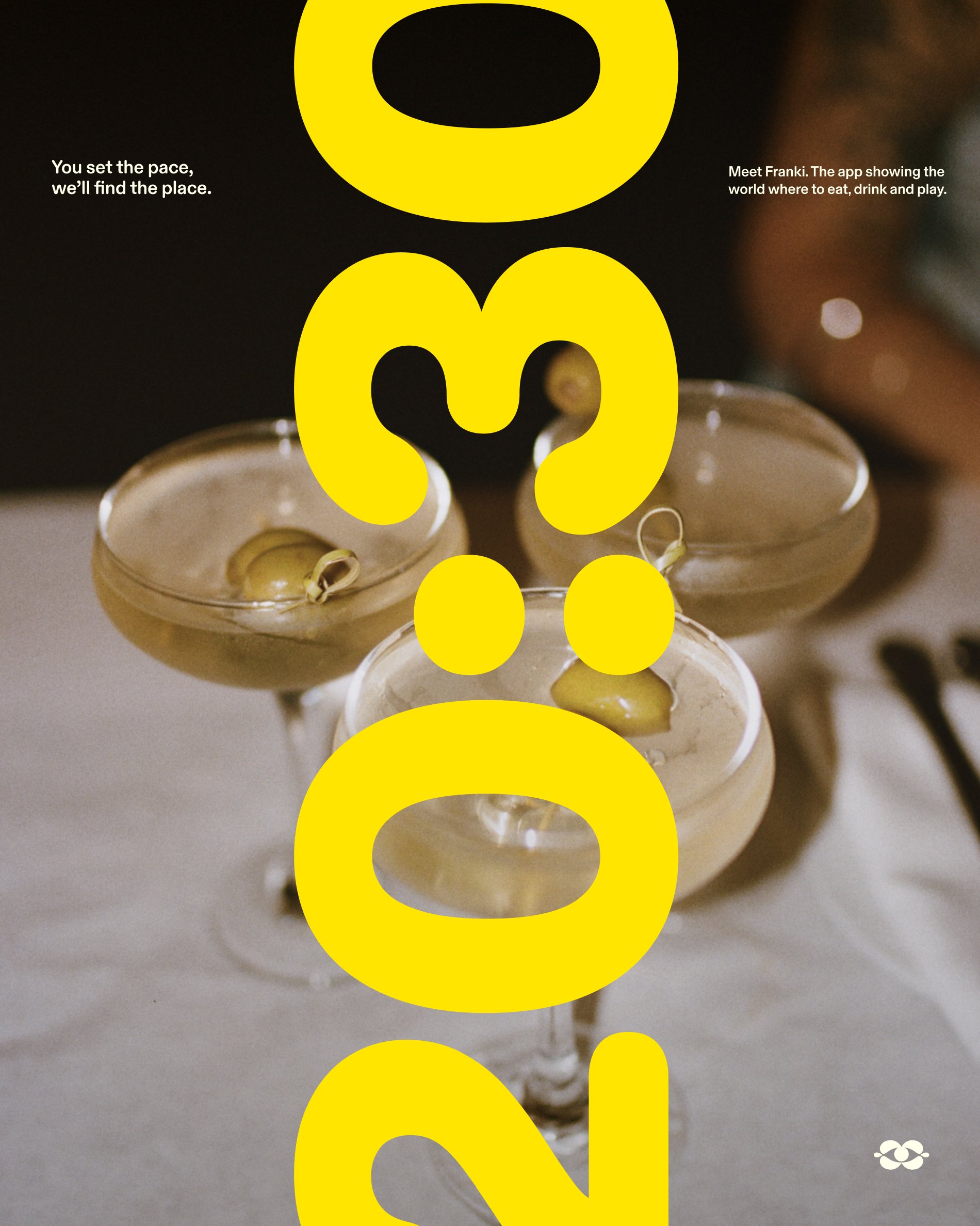
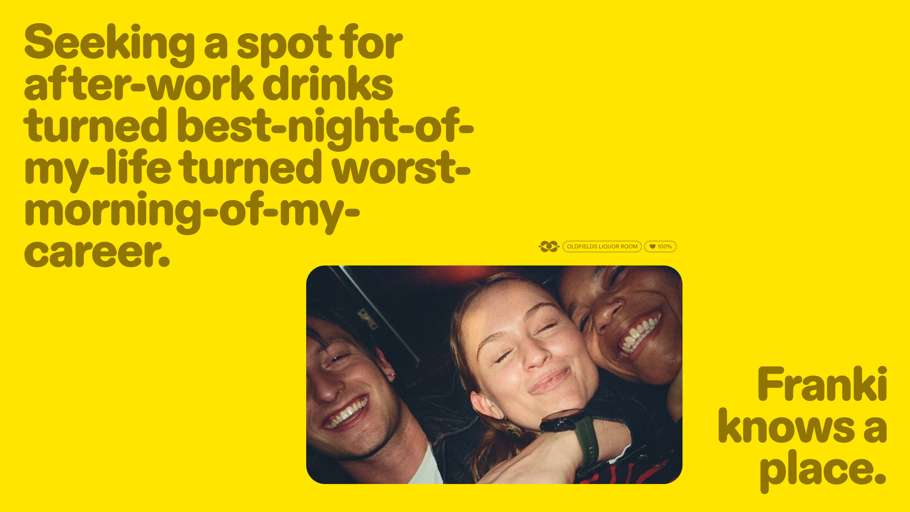
Diatype Rounded carries the headlines, and Koto lets it run huge. On the yellow poster, a single line about after-work drinks stretches across the top in gold-brown letters while a small candid photo and the line Franki knows a place sit low on the right, so the hierarchy is blunt: joke first, proof second, sign-off third. The same grid repeats in the IWYK poster, where the four letters fill the top of the frame and the small print, the symbol and the FRANKI lockup gather in the lower right corner. Even the wordmark keeps the same soft geometry, with round bowls and terminals that match the symbol.
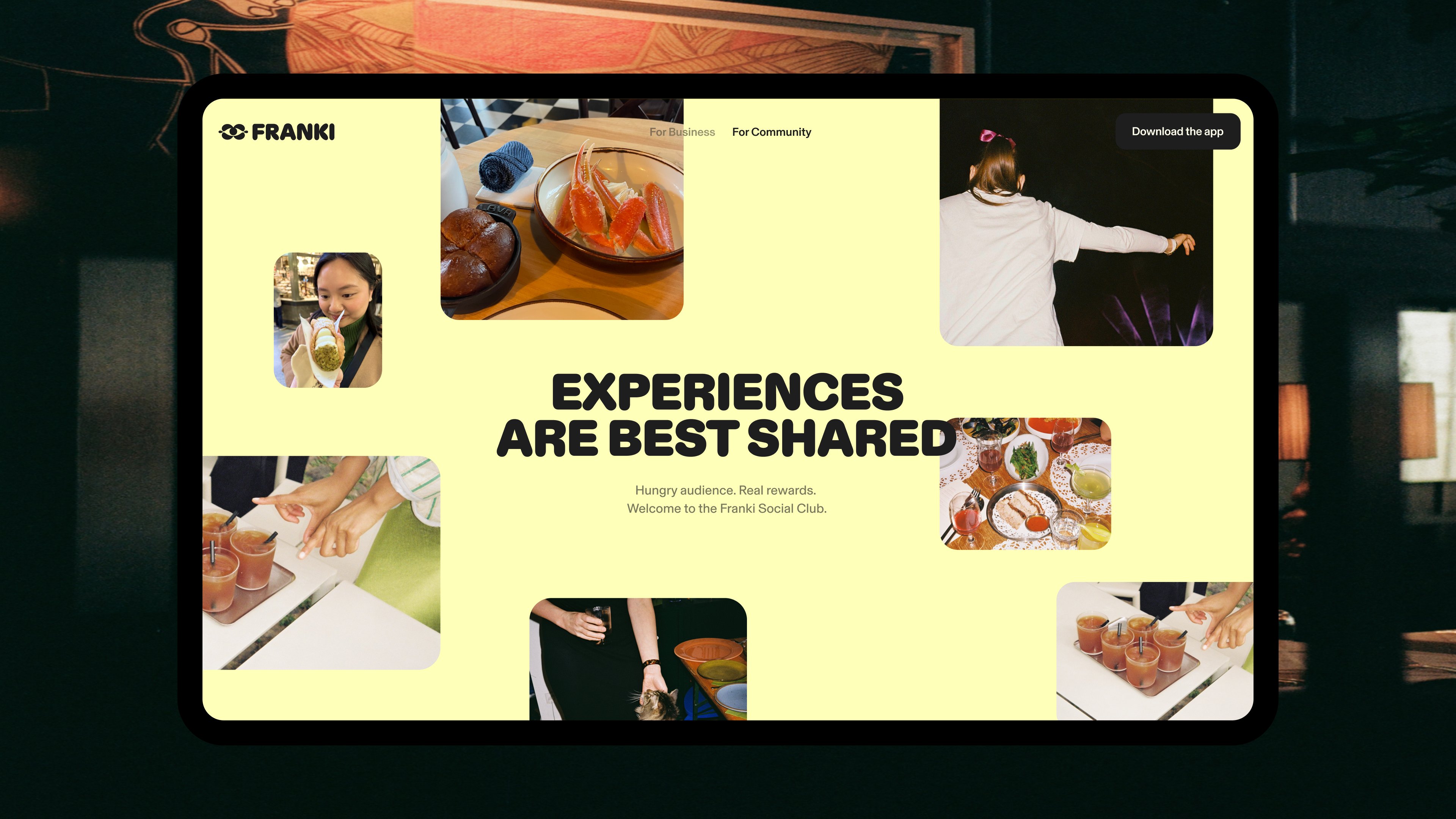
The Franki branding system is built for a video-first app, so it has to work as motion as well as print. Koto says motion drives the system across typography, UI and content, giving it rhythm, momentum and a playful confidence, and the stills already suggest that movement: type set at poster scale, photos cropped into rounded cards, and a palette of Bright Yellow and Gold against off-white and charcoal that stays readable at phone size. Franki Social Club carries the same language off the app and into the world, rewarding creators and diners for recommendations, and the website frame in the set shows it plainly: Experiences Are Best Shared, over a grid of food, drinks and people.
See more from Koto on their Franki project page.