Snask rebuilt the beauty e-com Vivantis from strategy up: a wordmark that plays on its name, playful icons, and the Hello Gorgeous concept.
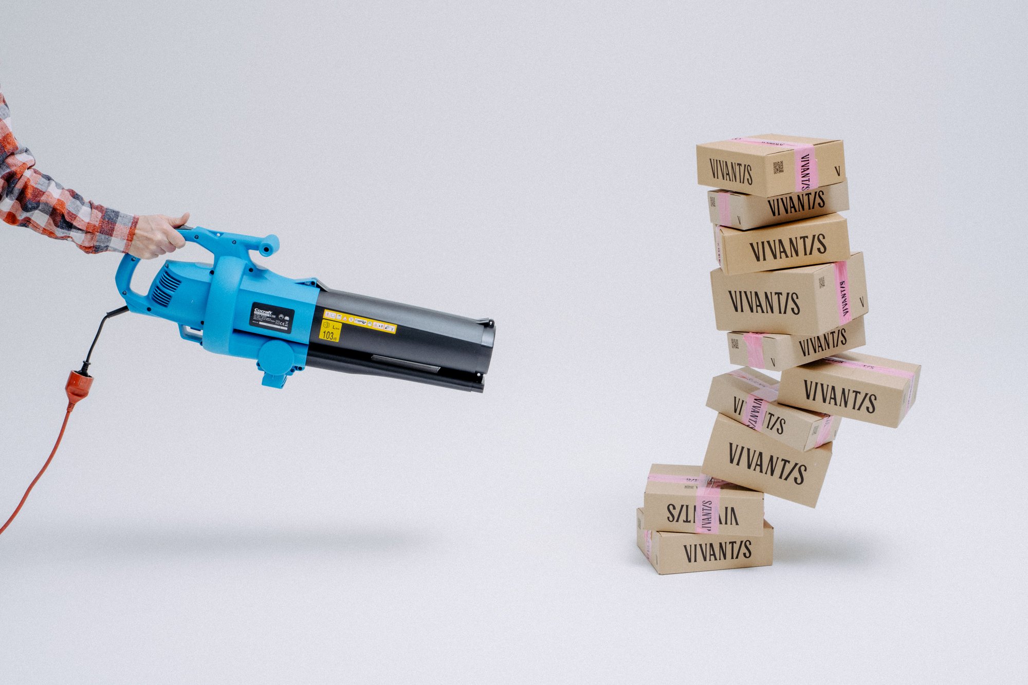
Vivantis is one of Europe's largest beauty e-coms, serving the Eastern European market, and it came to Snask with a brand nobody loved. Customers picked it on price and product alone, with no loyalty and nothing to talk about. The studio's answer starts with voice: the new identity talks like your no-BS best friend, the one who looks back at you from the mirror and says hello gorgeous. The look backs it up. The VIVANT/S wordmark splits the stem with a confident slash, and around it the system layers expressive frames and small icons: rainbows, cherries, lightning bolts, four-pointed sparks. Bubblegum pink and sunny yellow set the tone, and the launch photography has Snask's usual mischief, a leaf blower aimed at a trembling tower of branded boxes.
Inside the Vivantis rebrand: typography, voice and icons
The type does the heaviest lifting. Snask notes the name reads like "we want this", and the logo leans into that pronunciation with a look all its own: a high-contrast display cut with sharp terminals that keeps its nerve at shelf scale. Supporting copy goes big and loud instead, with HELLO GORGEOUS set in a narrow, punchy grotesque across the merch. The case launched autumn 2025 after Snask produced the photos and film themselves.
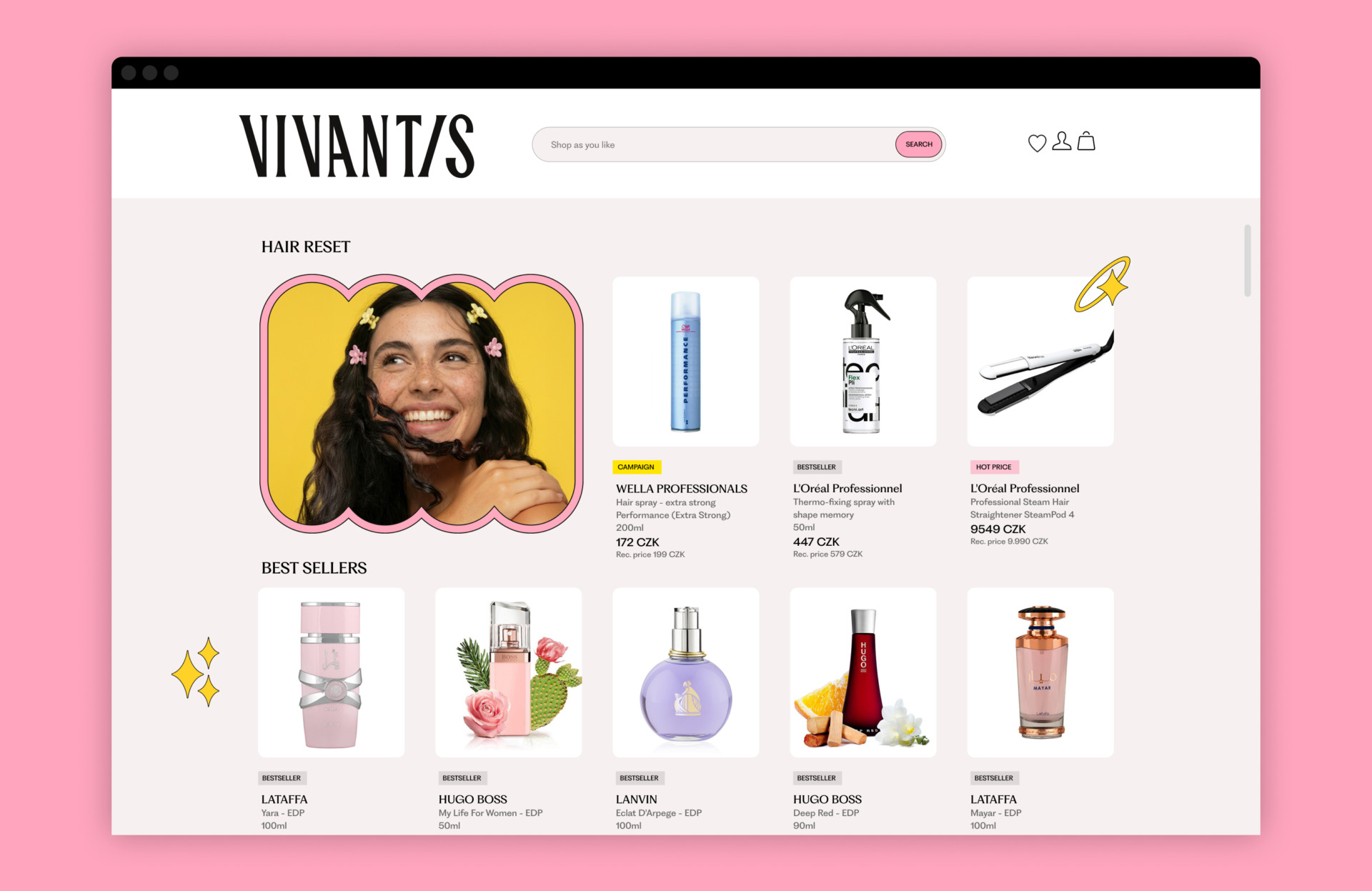
On the web store the hierarchy calms down. The wordmark holds the header, product cards sit in an orderly grid, and the frames and icons do the talking: a campaign frame here, a spark there, with category tags keeping everything easy to scan. Nothing fights the product, which is the whole point of the rebrand, giving shoppers a reason to come back that price alone never gave them.
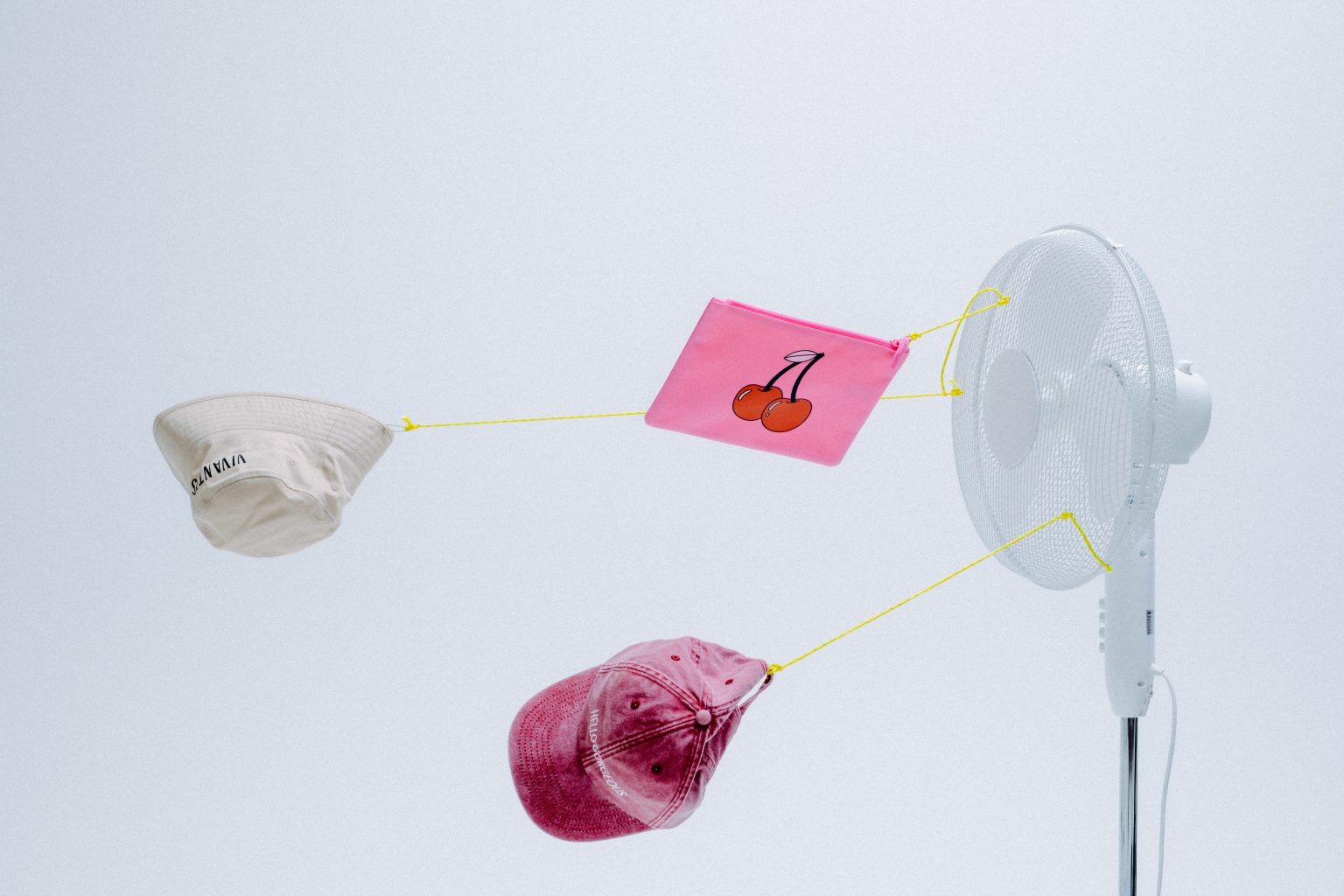
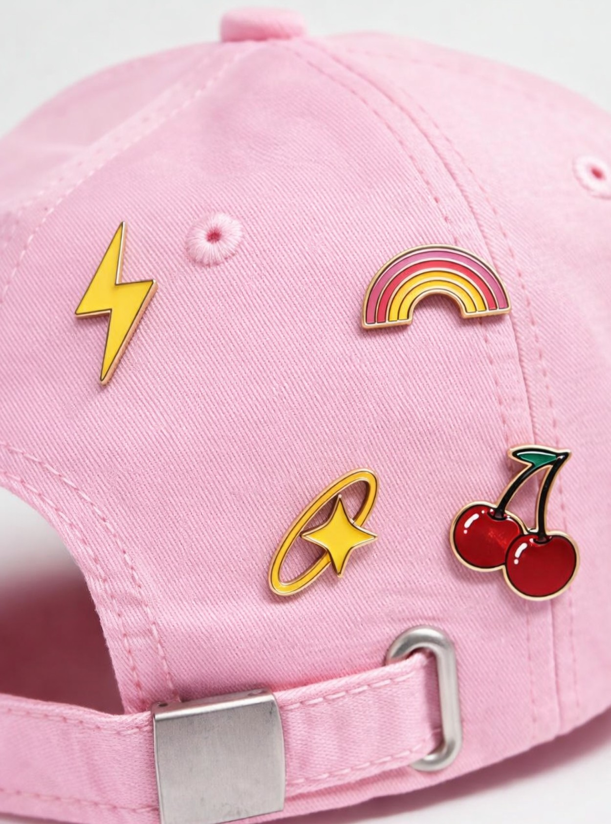
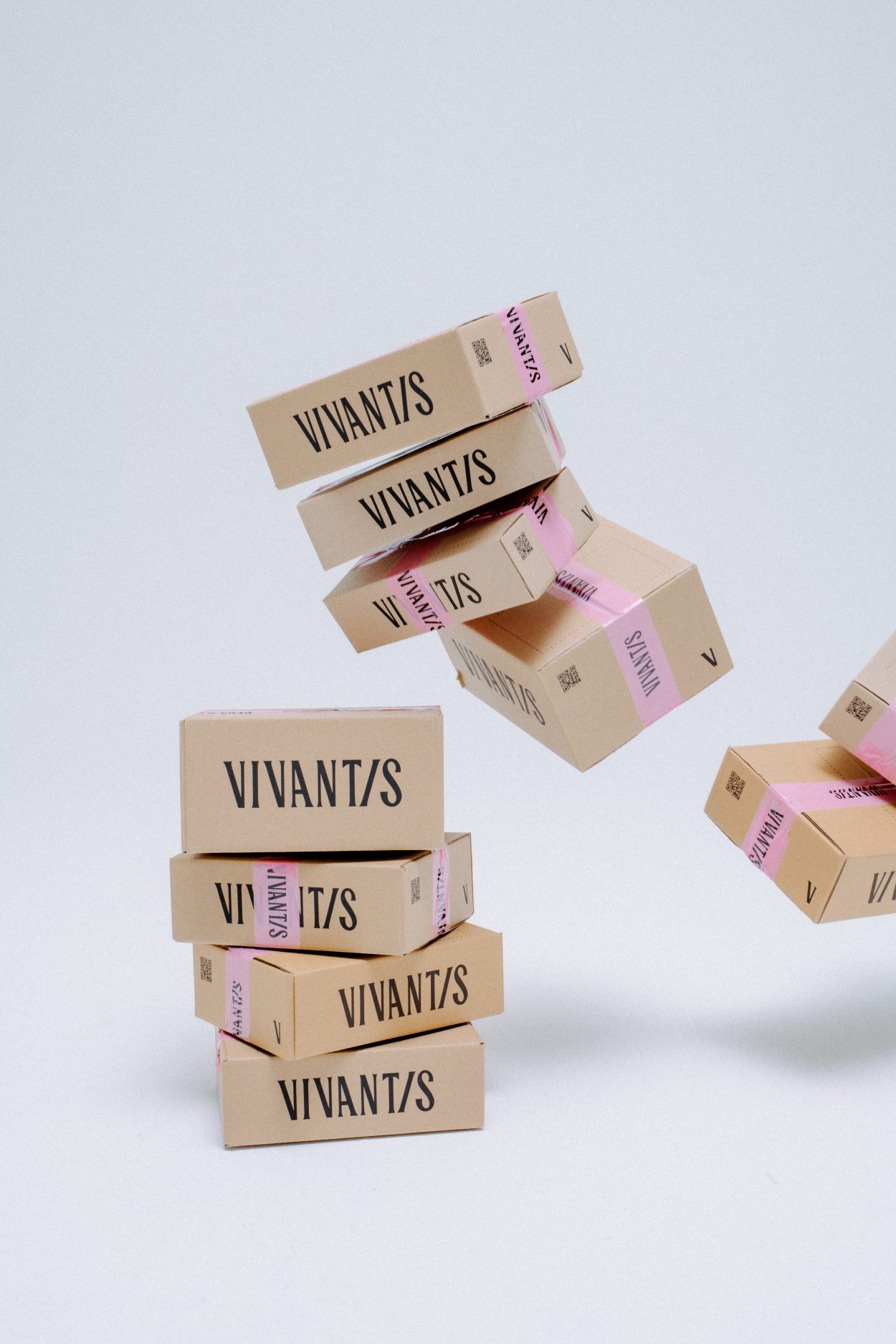
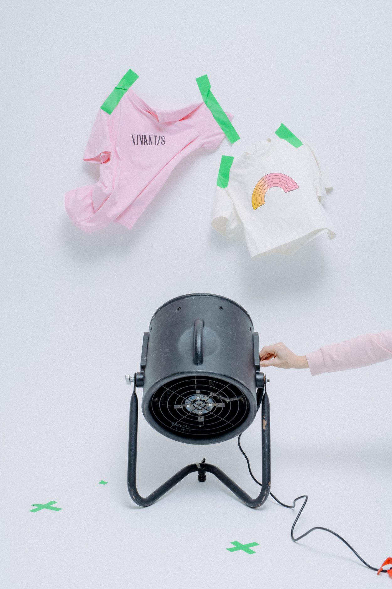
In the physical world the brand is all about texture. Shipping boxes carry the wordmark oversized, sealed with pink branded tape. Enamel pins from the icon set dress a pink cap, and the merch range runs from tees to bucket hats. The studio's own shoot shows the making of it all, tees taped to the wall, merch suspended on yellow cords, fans standing by to keep everything floating.
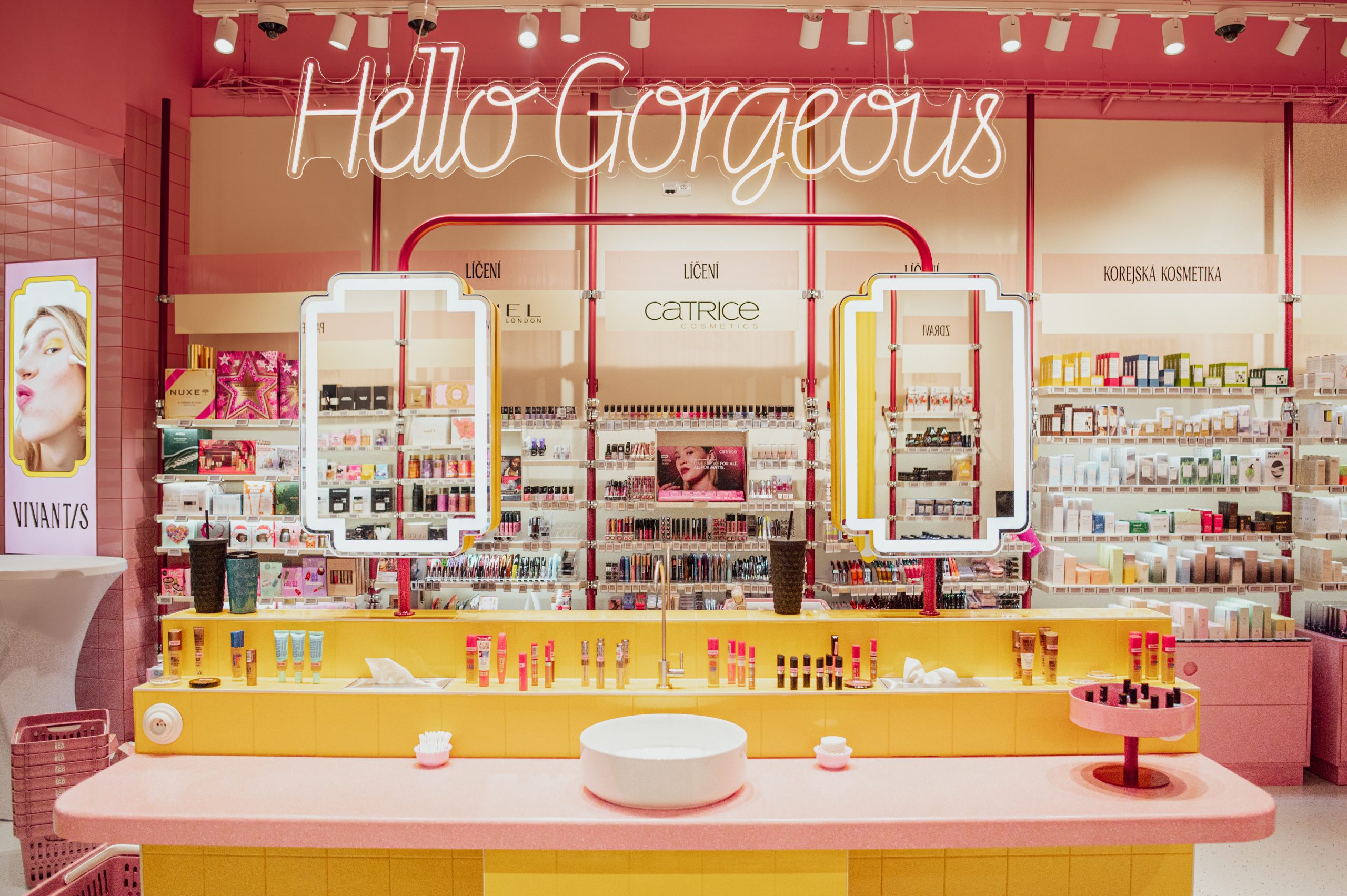
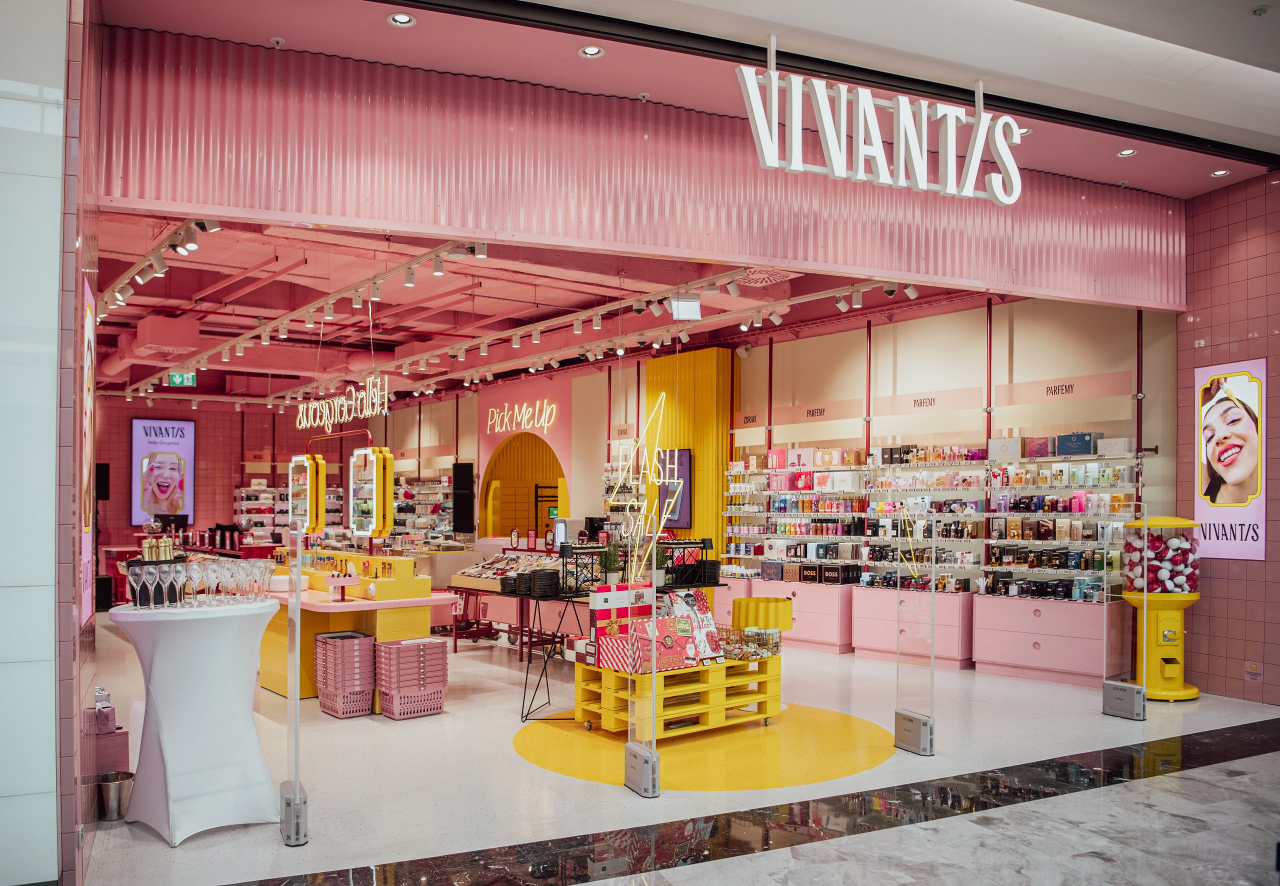
Snask also designed the store concept for the new flagship, taking the whole system into space: pink shelving, a yellow service island, neon Hello Gorgeous signage, and wayfinding that speaks the same playful language. Digital, physical and retail all land as one voice, which is exactly what the brand was missing before.
See more from Snask on their site.