Our weekly design roundup features the finest projects showcasing structural rigor, visual tension, and uncompromising typographic systems.
This week's selections reject soft templates. By utilizing strict grid systems, high-density variable fonts, and clean layouts, these designers establish visual tension that commands attention across both digital and physical touchpoints.
Em. Ma. Arkitektur — Lundgren+Lindqvist
A branding and web design project featuring minimalist dashboard layouts and precise typographic grids. View Project
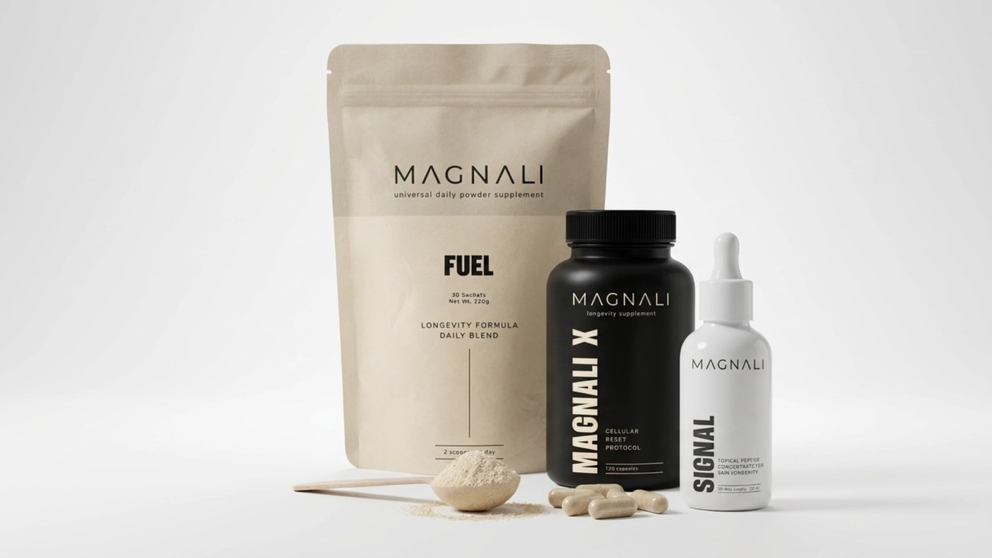
Minimal Supplement Packaging — Helen Arkhipochkina
Clean, science-driven supplement packaging leveraging structured laboratory typography and neutral tones. View Project
Million Typeface — Rajesh Rajput
A condensed variable display typeface built for vertical mass and typographic dominance at large scales. View Project
LOCOMOTIVE — Artur Ardvenev
Bold concept designs for the Montreal agency, integrating fluid spatial 3D elements into modernist grid structures. View Project
Oblio Magazine — Federico Agnelli
An editorial concept built around brutalist graphic layouts, tight whitespace, and extreme hierarchies. View Project
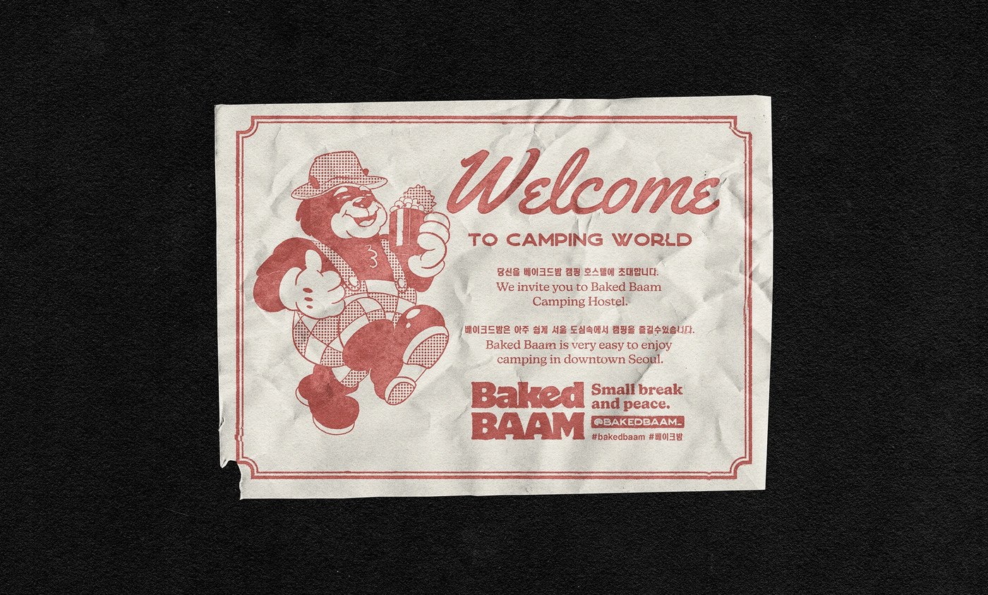
Baked Baam — Monga Design
Playful canned-bean glamping aesthetics meeting bold typographic packaging layouts for a Seoul hostel. View Project
Type in Motion — Mat Voyce
Expressive animated typography loops transforming flat 2D character letterforms into moving commentary. View Project
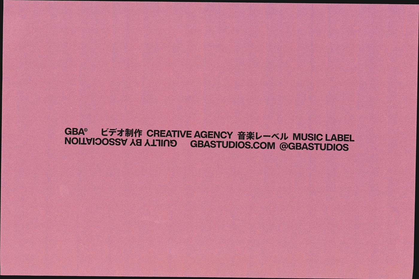
GBA Studios — Lundgren+Lindqvist
A striking identity system using inverted typography to slow down and examine surface-level visual recognition. View Project
Interactive Design Portfolio — Chris Hartmann
A clean, responsive web portfolio built on asymmetric grids, smooth transitions, and visual simplicity. View Project
Shinsegae 2026 — DIVE STUDIO
An architectural facade transformed into a media art installation mimicking a giant wind-up music box. View Project
Stay tuned for next week's roundup, where we will explore retro-futuristic styling and eclectic editorial compositions.