This week's curated selection highlights the structural tension between physical materials, dynamic motion, and typographic systems.
Our top picks include the following projects:
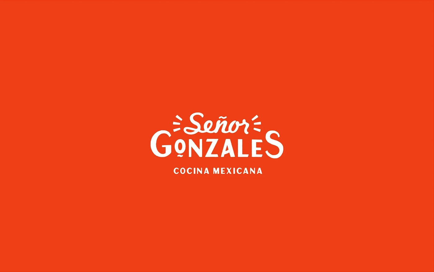
- Senor Gonzales Brand Identity by Heavy: Abstract illustrations, bold color grids, and custom vernacular lettering. Avoids cultural clichés. (Link: Heavy)
- Nohemi Typeface by Rajesh Rajput: Nine weights compressed into a variable geometric display face, optimized for scalability. (Link: Rajesh Rajput)
- Type in Motion by Mat Voyce: Playful monthly kinetic type loops where motion defines meaning. (Link: Mat Voyce)
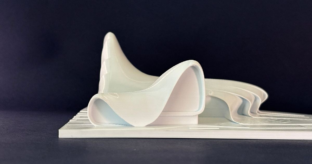
- Heydar Aliyev Center 3D Model by Adrian Martinez: A 1:1000 scale model of Zaha Hadid's parametric curves optimized for FDM. (Link: Adrian Martinez)
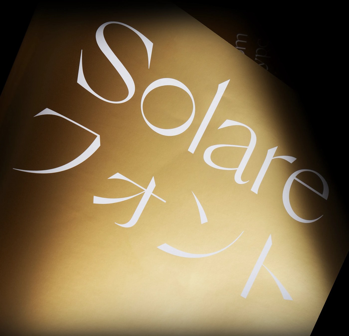
- Solare Typeface by Nikolas Type: Five-year variable font project blending structural grotesque geometry with warm serif details. (Link: Nikolas Type)
- Lumina Installations by Found Studio: Floating metallic spheres in simulated spatial environments exploring light and gravity. (Link: Found Studio)
- JFK Terminal 8 Identity by Applied Design: Clean signage system and navigation grids. (Link: Applied Design)
- Norton Museum of Art by Koto: Warm editorial typography and spacious layouts. (Link: Koto)
- Young Vic Identity by Venturethree: A blurred kinetic logotype representing fluid theatrical experimentation. (Link: Venturethree)
Next week, we examine how next-generation digital interfaces adapt physical materiality to reduce cognitive load in workspace platforms.